KOMMUNITY PARKING APP
Kommunity Parking user research for a mobile app
experience — iOS
Methodologies
Emphasize
Choosing to do secondary research (existing research) then primary research (firsthand research) was an efficient way to find out what was already out there before discovering my own findings. During the secondary research, there was an underlying tone of an obvious infrastructure issue and plenty of expensive resolutions. Before moving into primary research, it was clear that there were close to no resolutions that utilized each other, the community.
Creating screeners was the best way to get an audience to choose from, before interviewing them. I conducted a screener titled, “Searching for Daily Commuters living in the city” and had 40+ people submit their answers to my questions. Next, I was able to review the participants' responses and select the ideal candidates to get a better look inside their insights and opinions. The interview process was where I gained most of my information to then synthesize.
“...I think building community in anyway, would benefit all of us, in general”
The Takeaway: People from all over are more often than not frustrated with parking on a weekly basis. 0% of the interviewees were utilizing members of their community to help with these issues, yet 100% agreed that they would be comfortable indirectly communicating with another user, if there were a platform.
Synthesize
Define
The process of identifying the problem with research had the best outcome when I used existing tools such as: affinity mapping, empathy mapping, and personas.
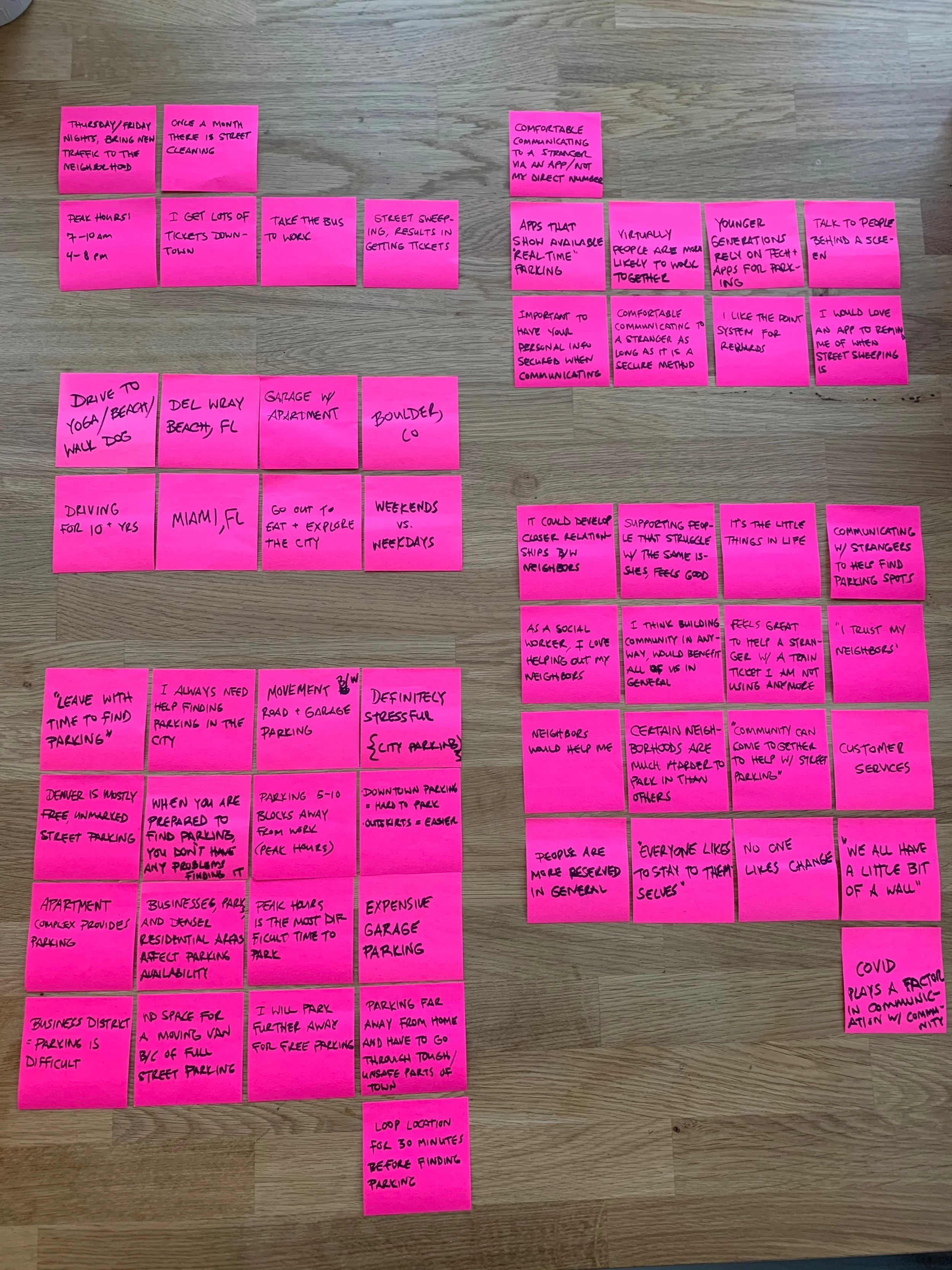
Affinity Mapping
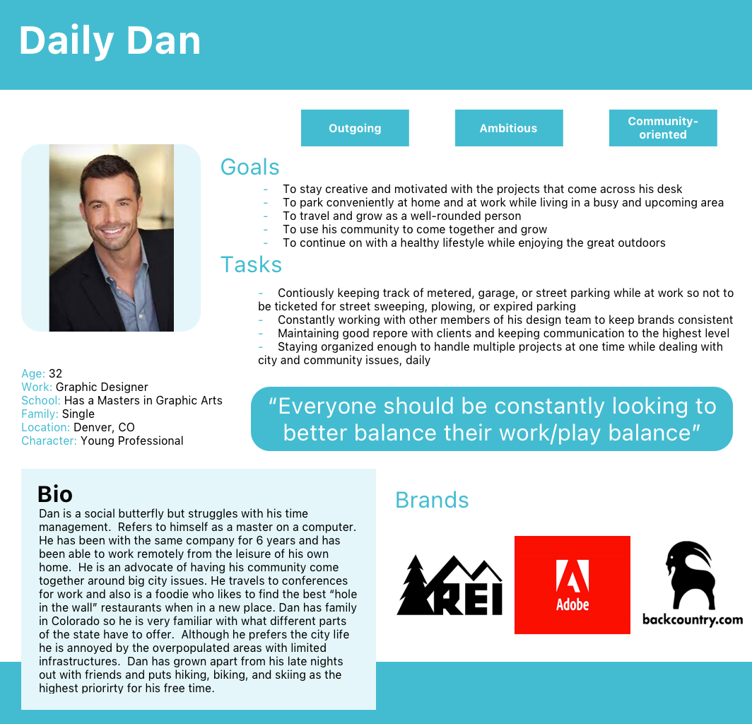
Persona #1
I articulated my problem statement using “how might we…” questions.
How might we use our community to help with street parking?
How might we avoid having to park in expensive parking structures?
How might we make parking painless and intuitive?
How might we make people in our neighborhood come together?
How might we make parking more intelligent and modern?
The Takeaway: I am designing an affordable, hassle-free product that requires little cognitive loading with little to no human-interactions. It is fair to say that a mobile application would be most efficient in allowing for ready-to-go mobility.
Design Thinking
Ideate + Design
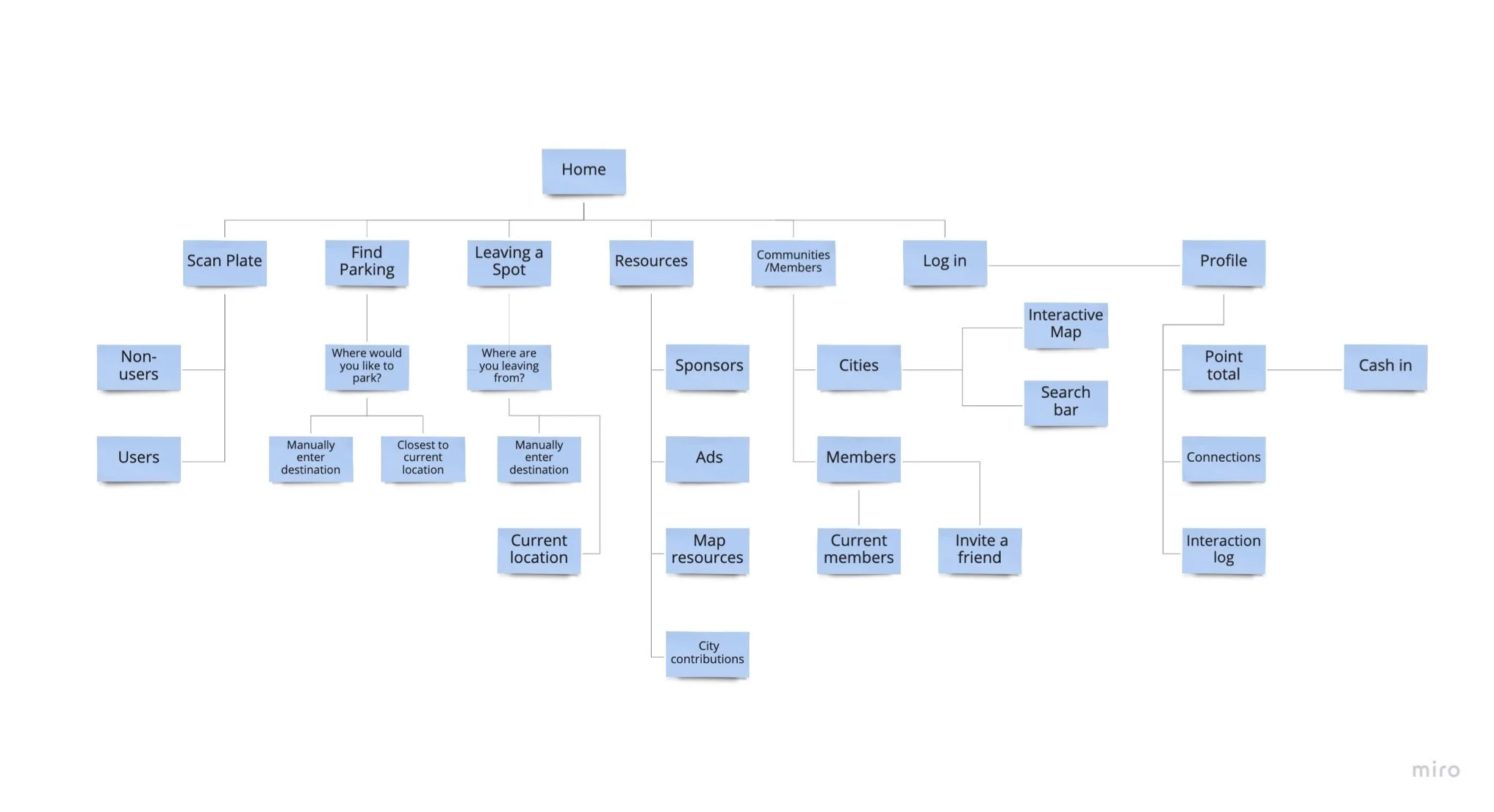
Now that I have identified a solution, it is time to create user stories, site maps, and user flows. These tools helped identify the functional needs of my product before actually designing it to meet those functional needs. During this process, I was able to identify my MVP (most viable product) by establishing my 3 main red routes. I originally made my main red routes as “find parking, scan a plate, and leave a spot.” During this ideation step, I was able to combine the “finding parking” and “leave a spot” and added the “onboarding” as a red route. This finding was an integral part of development before moving into the early design processes.
Site Map
Let the sketching begin!
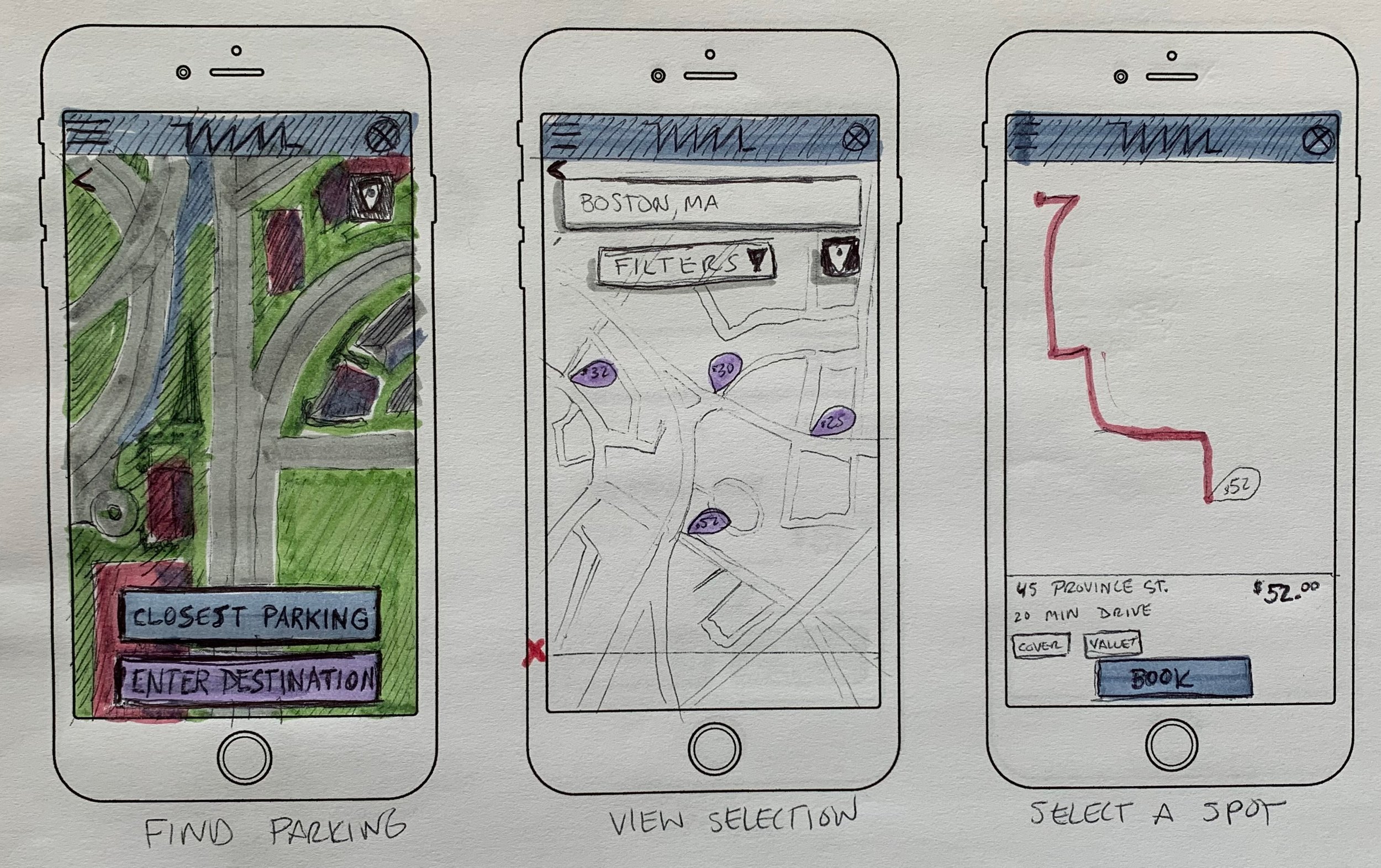
It’s time to take all the data and start to put these ideas to paper. I used sketches to make my ideas tangible so they can be tested and adjusted before I made higher fidelity versions of my designs (such as through wireframing and prototyping). Because this product is designed for a mobile application, I chose to design with a “mobile-first” approach. Designing for mobile devices forced me to prioritize features, functionality, and design elements for the smallest screens a user will use.
Sketches
Guerilla Usability Testing
Here is where I can get initial feedback on designs I’ve made. I can quickly identify which aspects of my designs are more intuitive and which are not. My guerilla usability testing involved asking random people (in my case, people in my apartment building) to glance at my designs.
Participants: 5 random participants
Location: In-Person (Portsmouth, NH)
Schedule:
Recruiting participants during the week of: 07/23 - 07/26
Conducting the test: as early as: 07/27 - 07/29
Share the results by: 07/29
Duration: 20+ minutes (each)
Findings:
After seeing the users interact with the sketches, I was able to conclude that the functionality seemed fairly intuitive. All the users were able to get from the home screen to the end screen for both red routes. Not all the sketched buttons were fully developed and those were where there was some hesitation from screen to screen. I think if all the buttons were fully functioning, the process to the end screen would have been smoother. One of the users communicated that the back button and the homescreen button (logo) features were super helpful.
After the participants finished completing the tasks, I asked them for feedback and if the primary purpose of this product was clear. The results were unanimous and all 5 participants agreed, the idea was clear. The feedback made me realize how simple and streamline this app needed to be. There were going to be more than 5 screens in order to find parking so I need every screen to be a fast and easy transaction. After analyzing the participants interacting with this design, I thought the method will work and the UI will play a large role in the success of this product.
Wireframes and Wire Flows
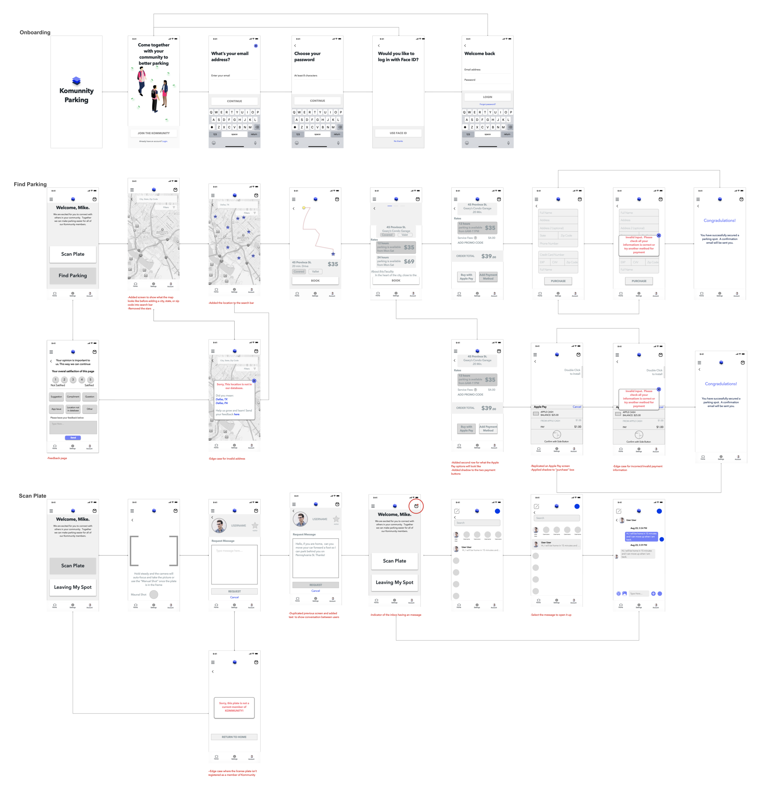
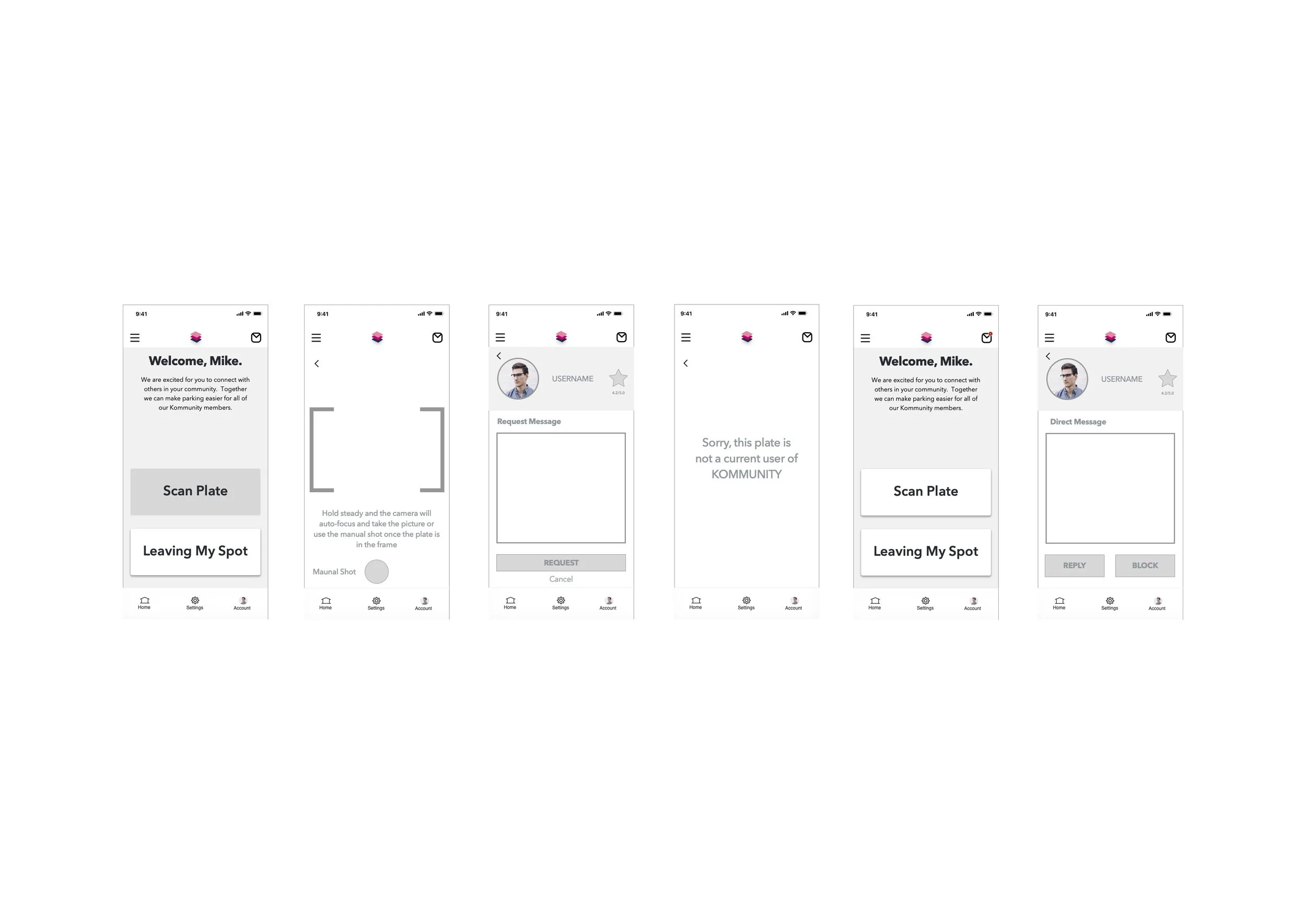
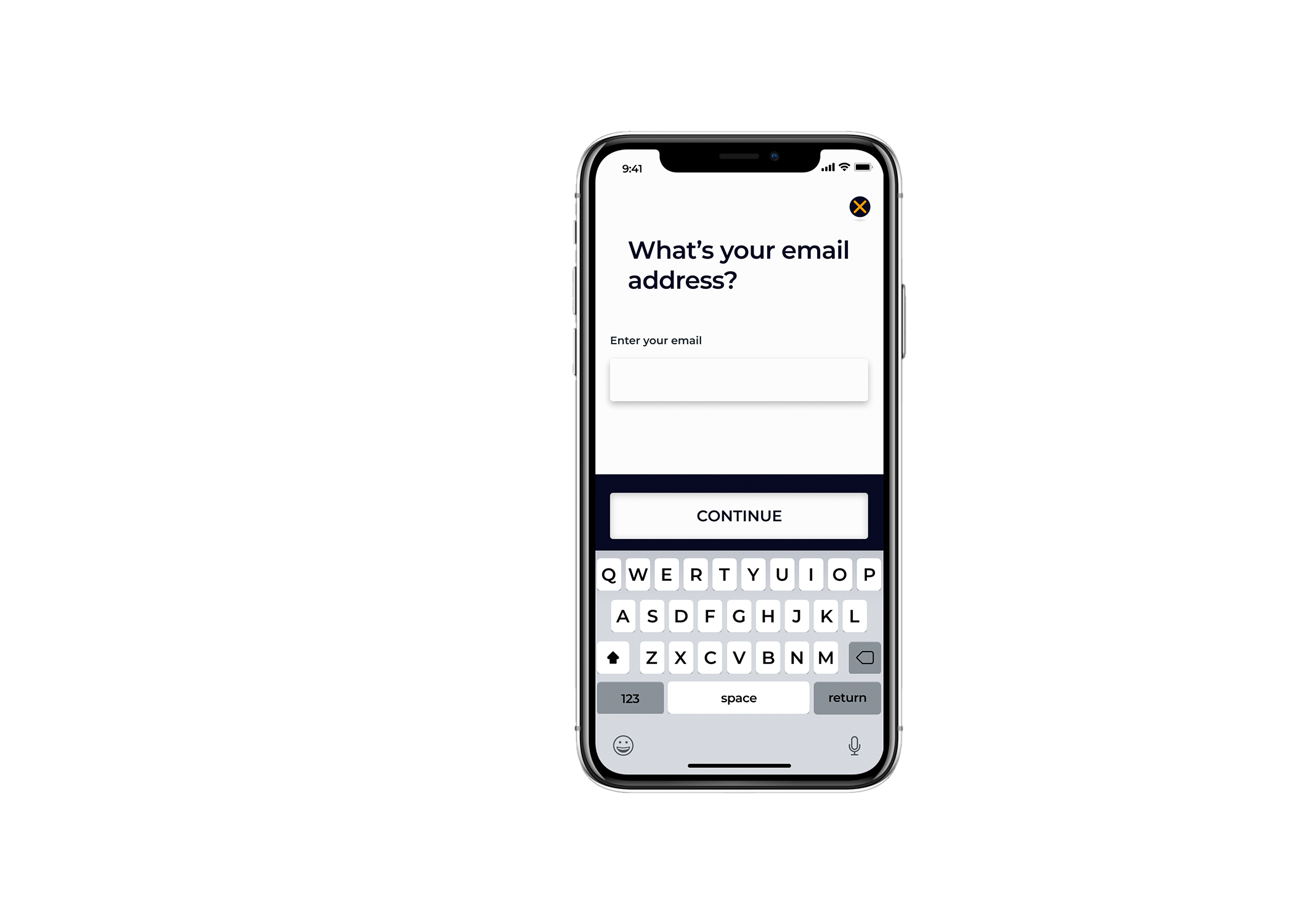
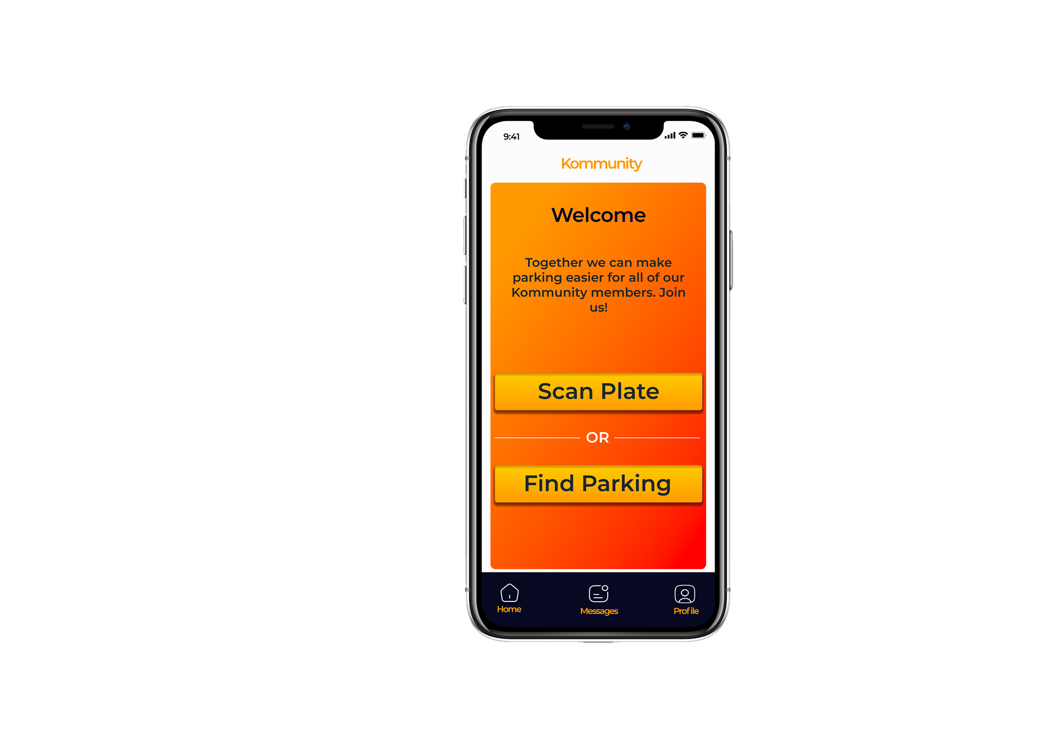
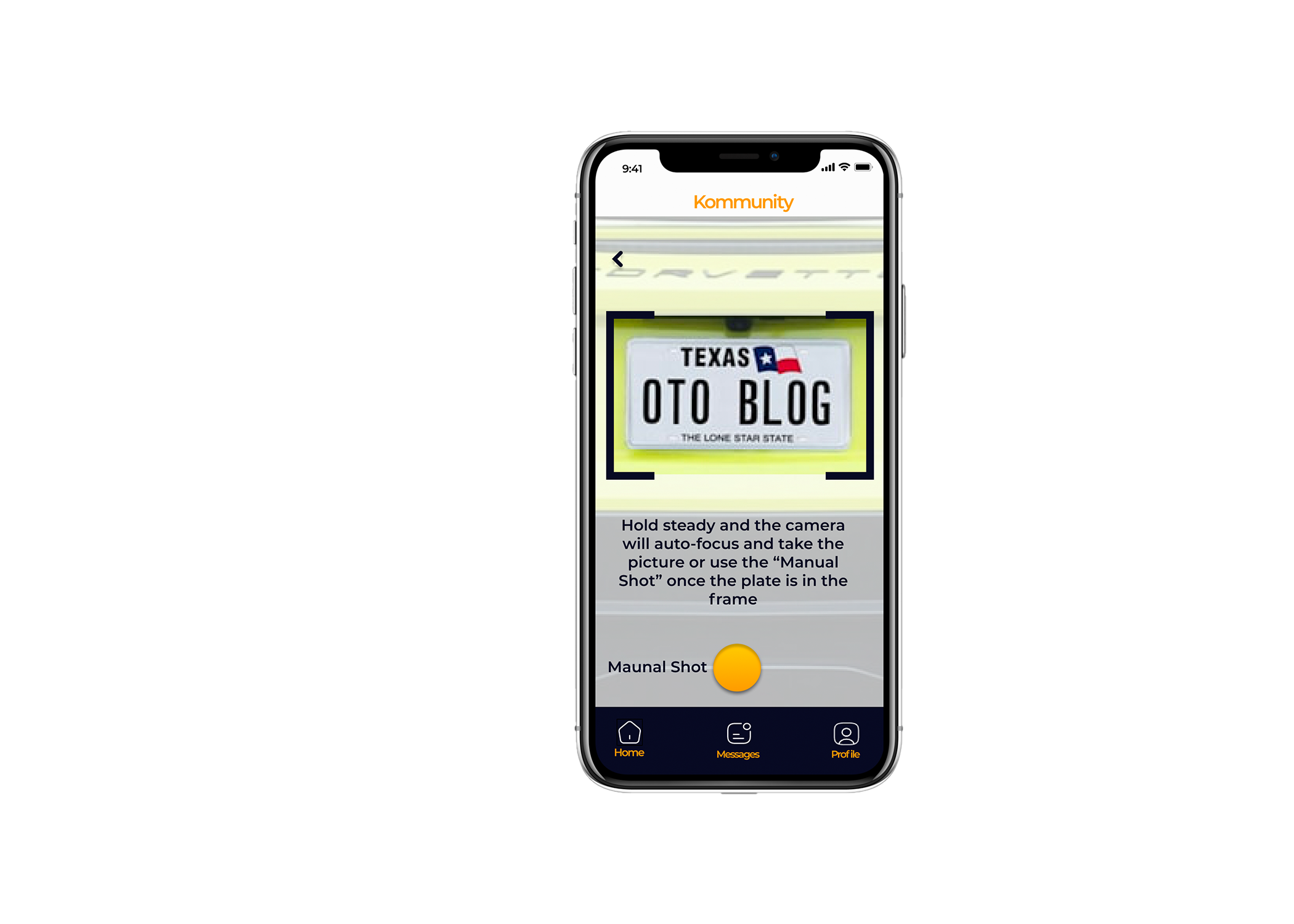
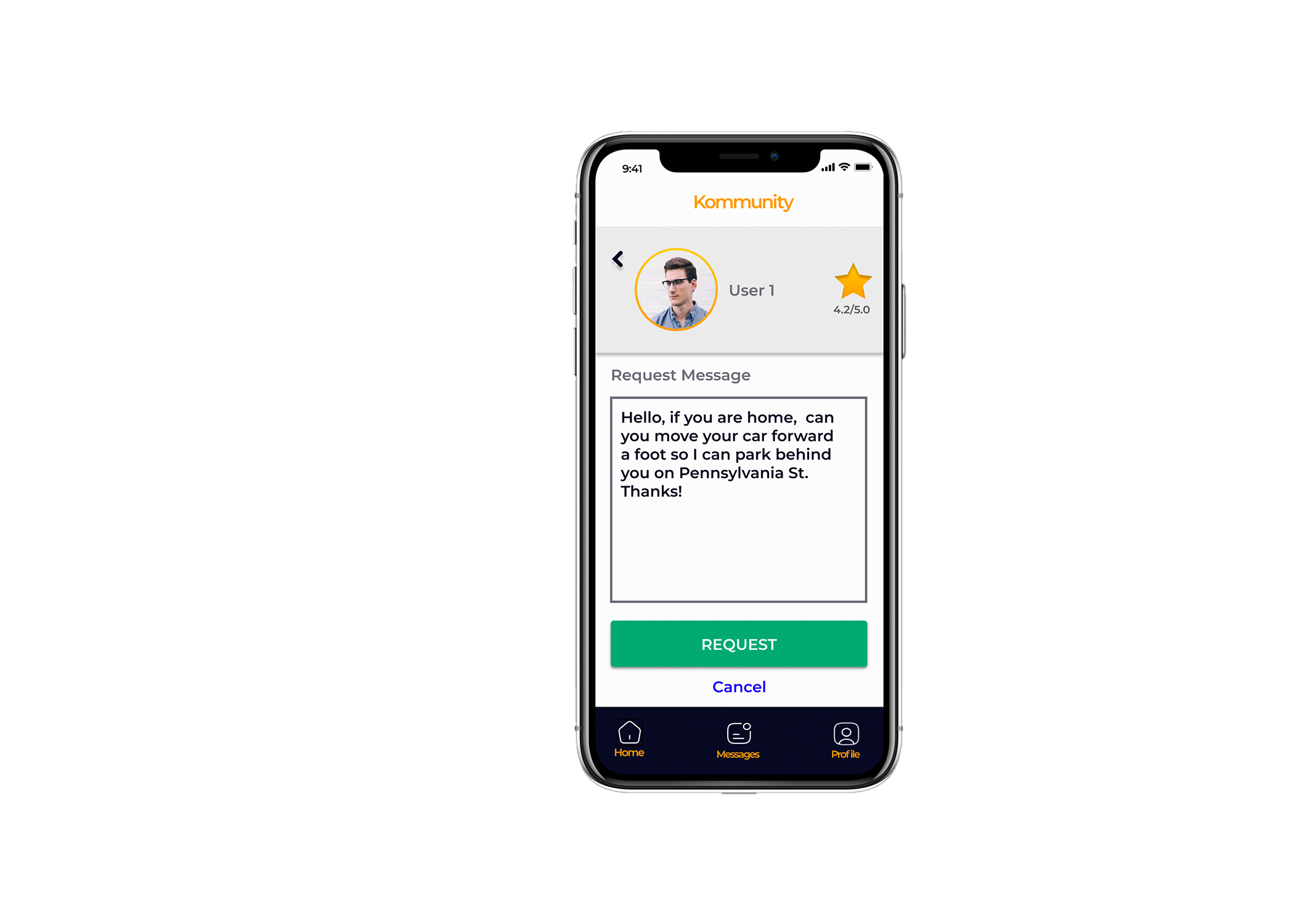
This is an exciting part in the process where I can finally digitally design. Using Sketch software, I designed my 3 red routes as well as their edge cases. You must expect the unexpected!
Wire Flows
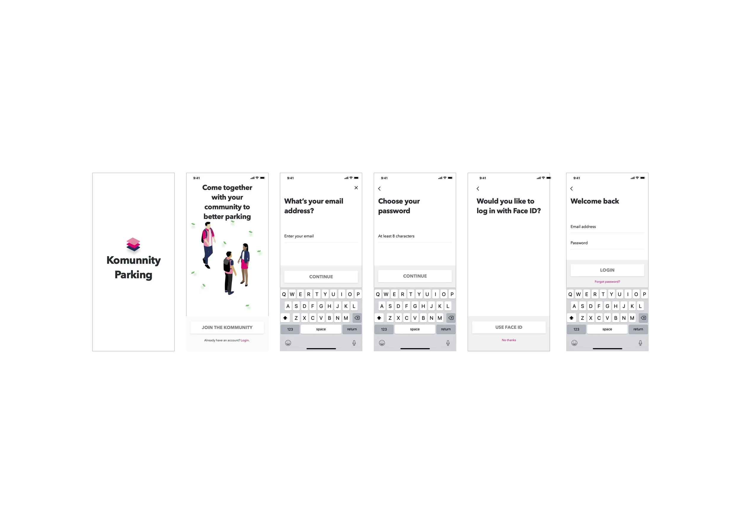
Onboarding
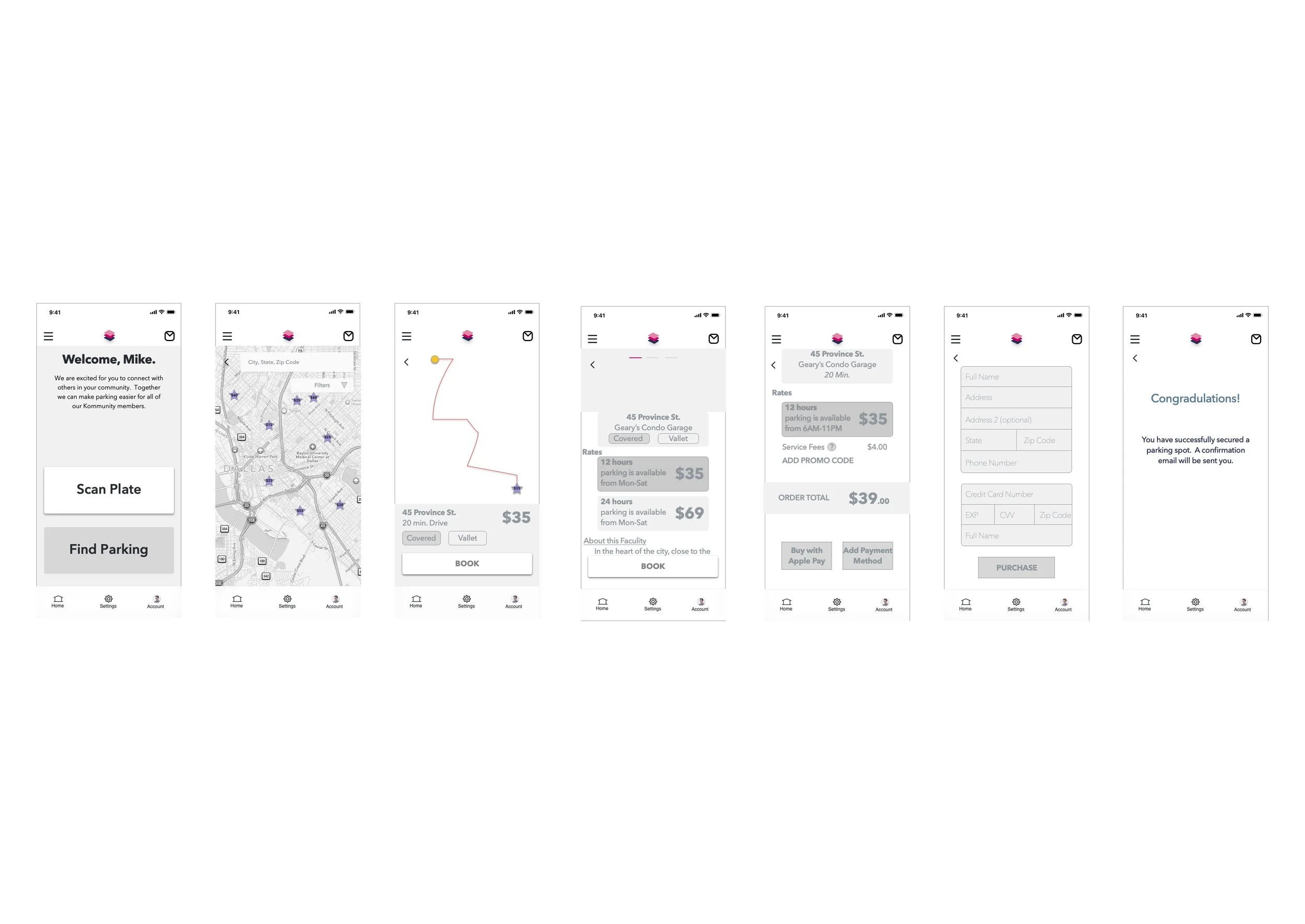
Find Parking
Scan Plate
Brand Platforms and Style Guides
Although I am solely working on this project, staying consistent is a vital part of developing a great product. I started with creating a brand platform, where I locked in my company name, mission/vision, and the brand personality/attributes. One other great tool I used to convey this was a mood-board. Next, I developed a style guide to use as a point of reference for building my high fidelity mockups. In this style guide I developed my:
Brand Logo (using Adobe Illustrator and Photoshop)
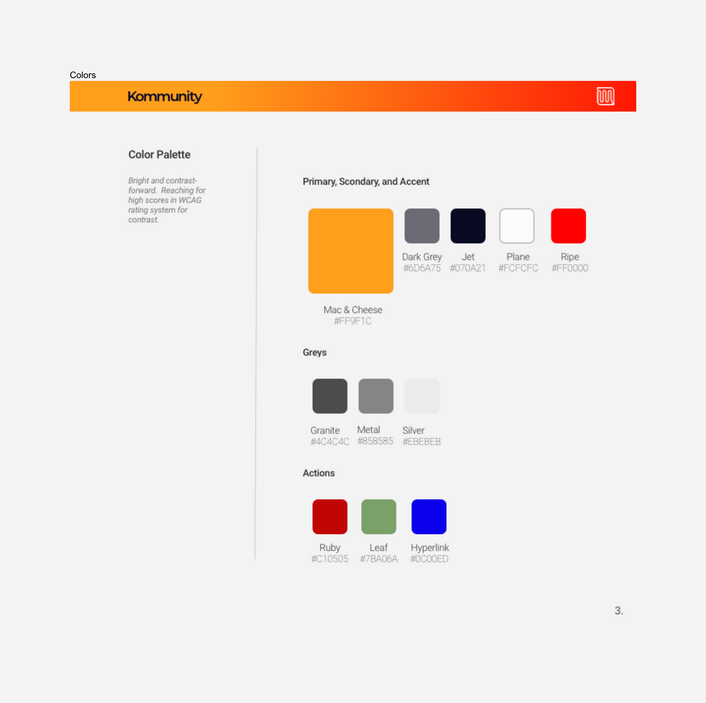
Color Palette (with help from Coolors.co and Cava.com)
Font (same font used in this case study)
Guide for Grids
Iconography
UI Elements
Photography and Imagery
Style Guide
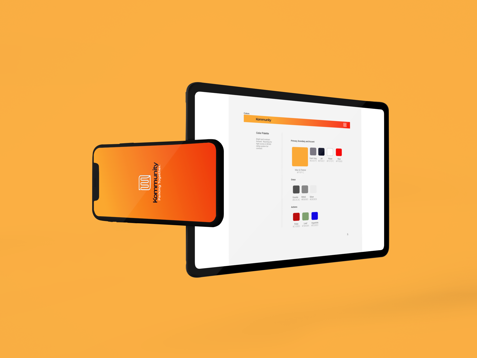
Color Palette
Logo: I wanted to incorporate the two “m’s” in the word (K)community into the logo design and started with this:
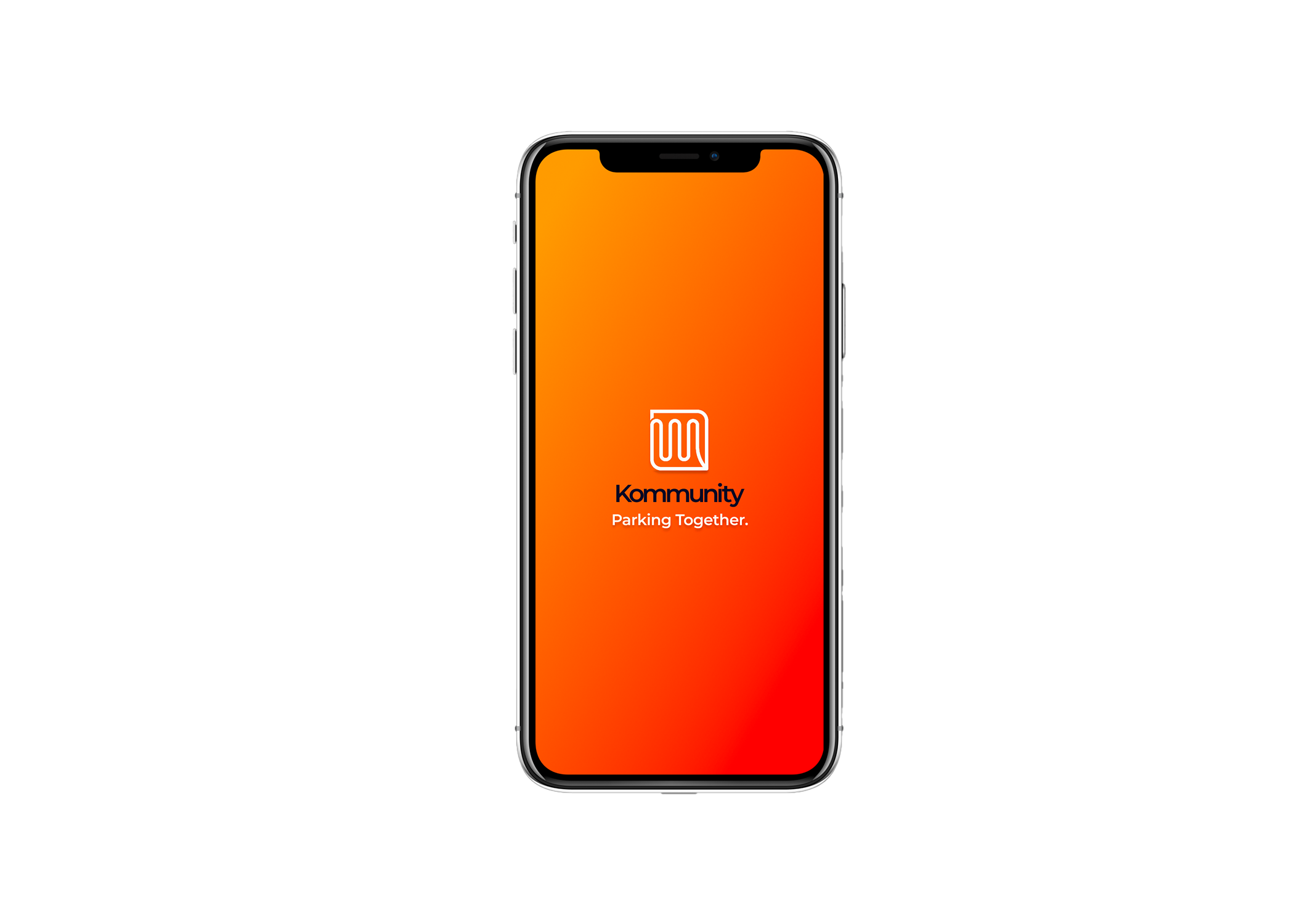
Then I revamped the design whilst keeping the double “m” in mind but also incorporating the togetherness of a community. Thus, the final product has the look of a zipper or interlocked hands to symbolize people coming together, while also foreshadowing the word (K)community.
High-Fidelity Mockups
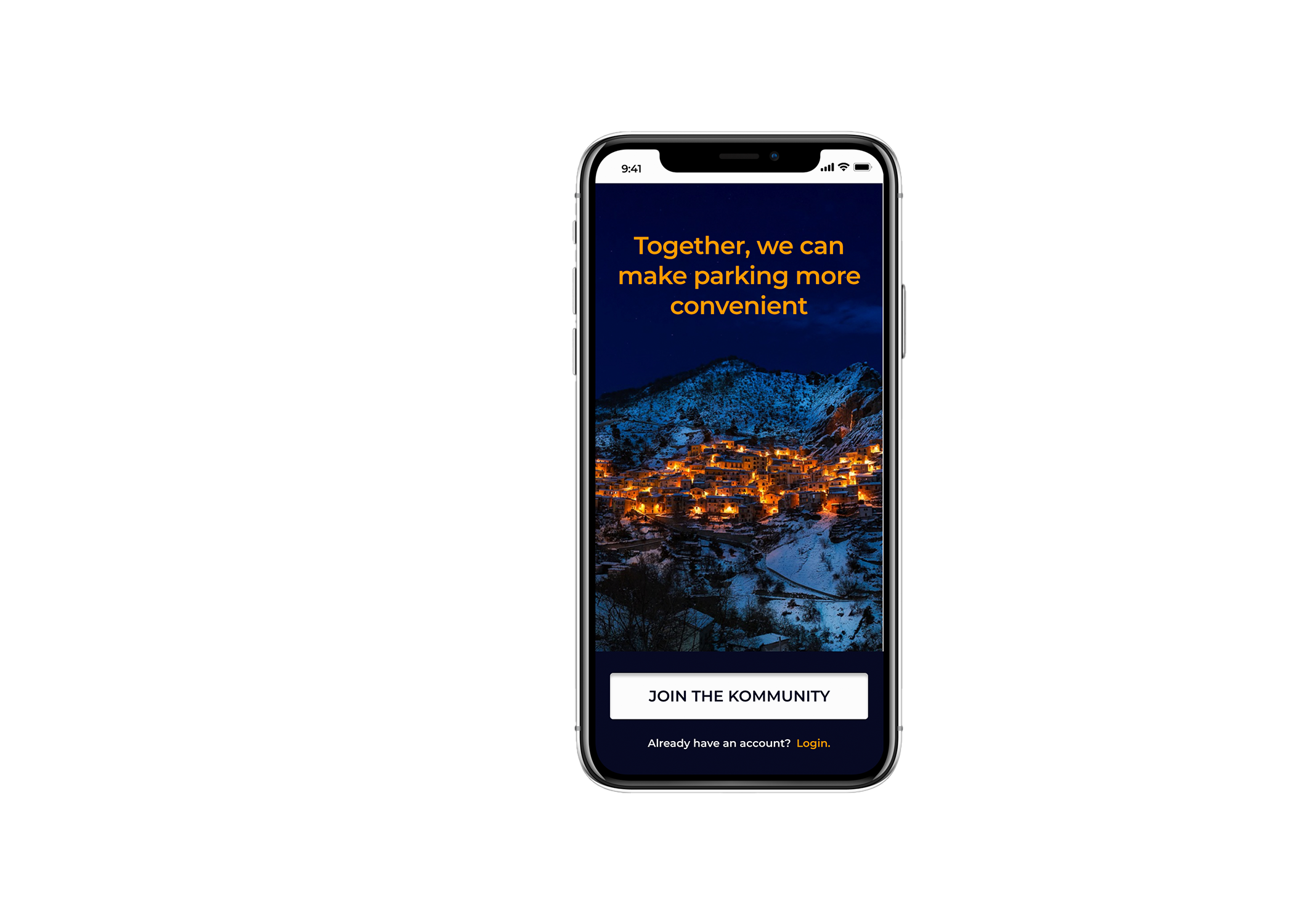
During the creation of my hi-fi screens, I was constantly referencing my style guide and also updating it as the screens came together. Originally, I started with a light matte purple as my main brand color and due to the lack of contrast with my dark and light background options, I switched to the current “mac and cheese” color. The importance of accessibility was constantly in mind when designing these screens because of the wide range of users projected for this product.
When selecting a font for the app, it was important to use an option that translates in different sizes and widths. I started with a traditional iOS font called “San Francisco” and felt it was just too familiar, so I did some research and decided on “Montserrat” for the win.
The takeaway: Before making any artistic decisions, it was extremely important to reference my research insights and style guide. This is what made this design a “living design” that can grow with this product and be adaptable down the road.
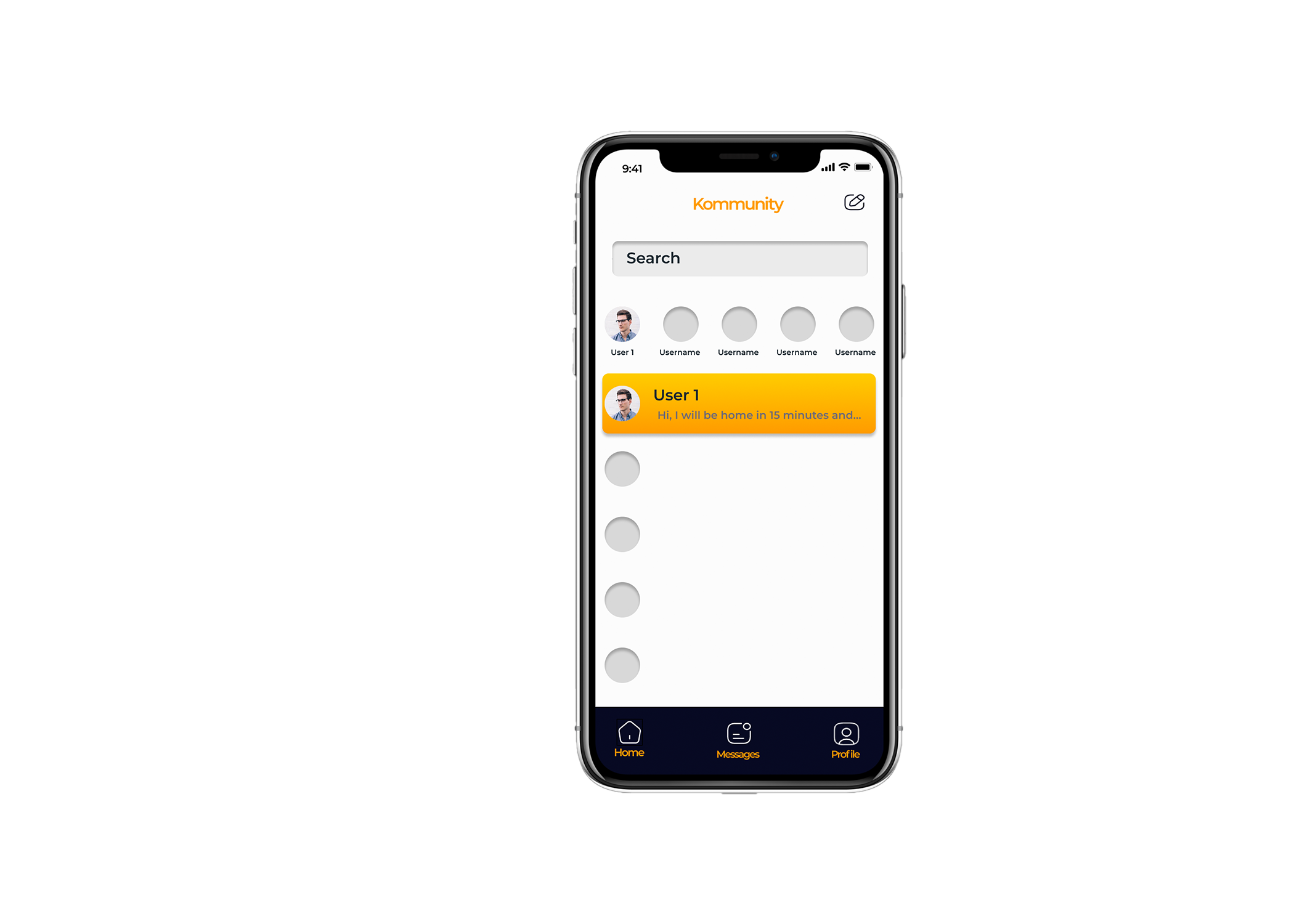
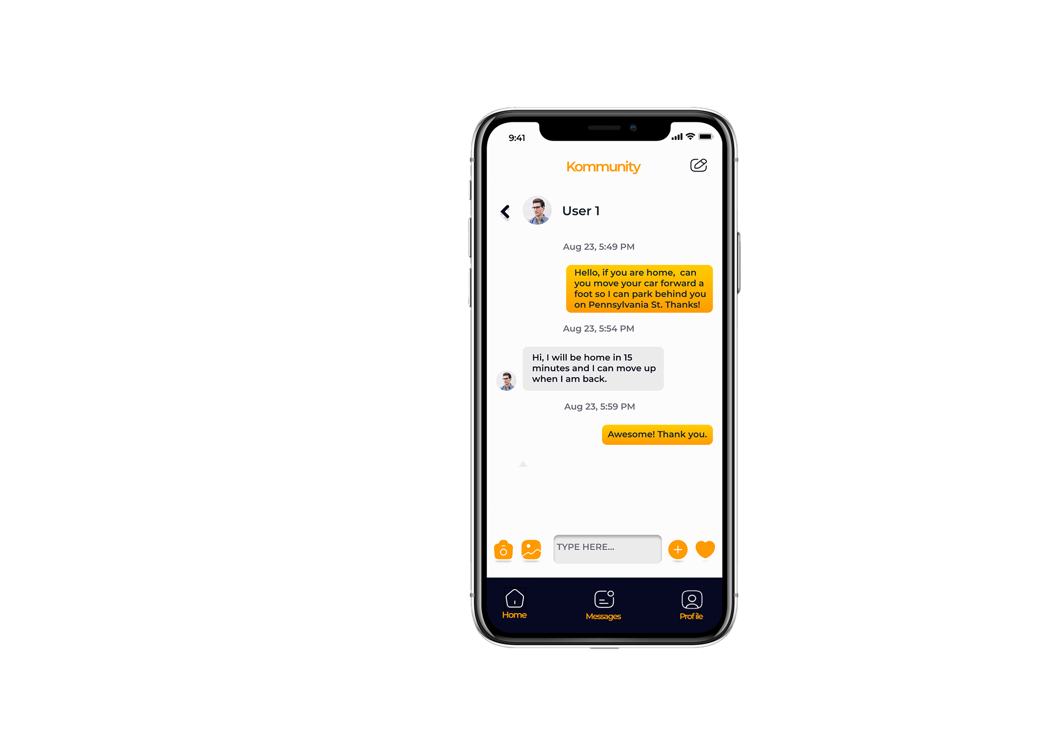
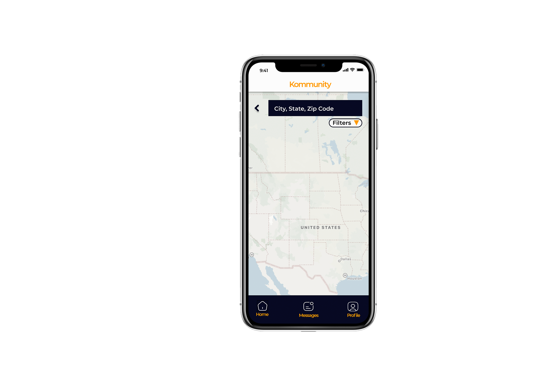
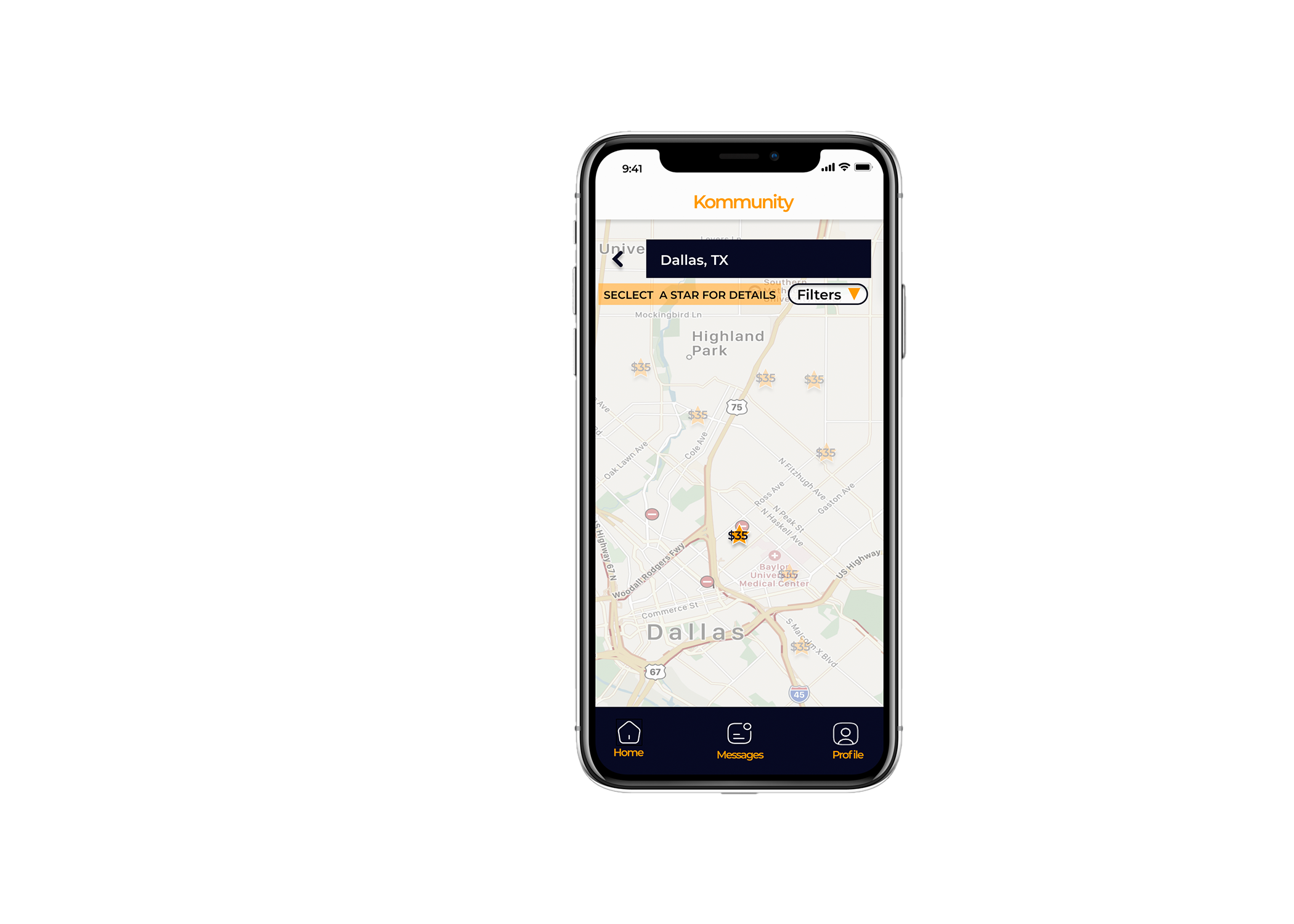
After some debate, I decided to use Figma as my platform to begin my prototypes. Here is where I can bring some of the buttons and functions of these screens to life (on a strictly functional level). With some functionality added to these screens, I was ready to get some insights from users and conducted my first usability test. I built a testing plan with objectives such as:
- Gather initial impressions of the UI of the screens
- Find where there is too much cognitive loading
- Discover any usability issues with the red routes
- Gain constructive insight that wasn’t considered in original design
- Understand any pain points when going through the red routes
Moderated Usability Testing #1
Participants: 5 (hand selected to fit the demographic of a typical user and range in age from 28 - 62)
Location: In-Person (Portsmouth, NH and Bedford, NH) or via Zoom calls
Schedule:
Recruiting participants during the week of: 11/07-11/13
Conducting the test: as early as: 11/11-11/18
Share the results by: 11/19
Duration: 30+ minutes (each)
Findings:
These insights helped me see this product from several different sets of eyes. After the testing, I made some design adjustments and then re-tested. The second round of testing consisted of 5 new participants, asked to do the same tasks as the first test.
Moderated Usability Testing #2
Participants: 5 new participants
Location: In-Person (Portsmouth, NH) or via Zoom calls
Schedule:
Recruiting participants during the week of: 12/08 - 12/12
Conducting the test: as early as: 12/12 - 12/17
Share the results by: 12/18
Duration: 30+ minutes (each)
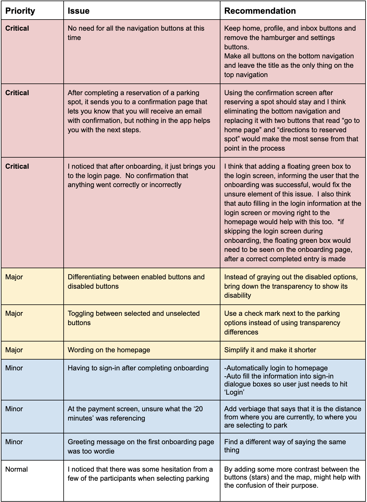
Findings:
After conducting the second round of usability testing, there was new input to help better the design. The biggest and most eye-opening idea came from Alex J., when he recommended using a QR code sticker for users to keep on their car so you wouldn't have to scan a plate to communicate. This idea is less intrusive and takes the guesswork out of whether or not the car you are looking at is a user or not.
During these tests, I received feedback about using a widget in the app for directions, instead of developing my own mapping element for the app. I like this idea because the task is completed by the time they need directions to the parking.
Another insightful finding was giving an average time of response of the users, once you connect with them via scan plate. You don’t want to be sitting in your car waiting for a response if it's gonna be a long time. If there was an indicator of how quickly this user responds (similar to their score under the star icon in messaging), then there would be a lot less time wasted.
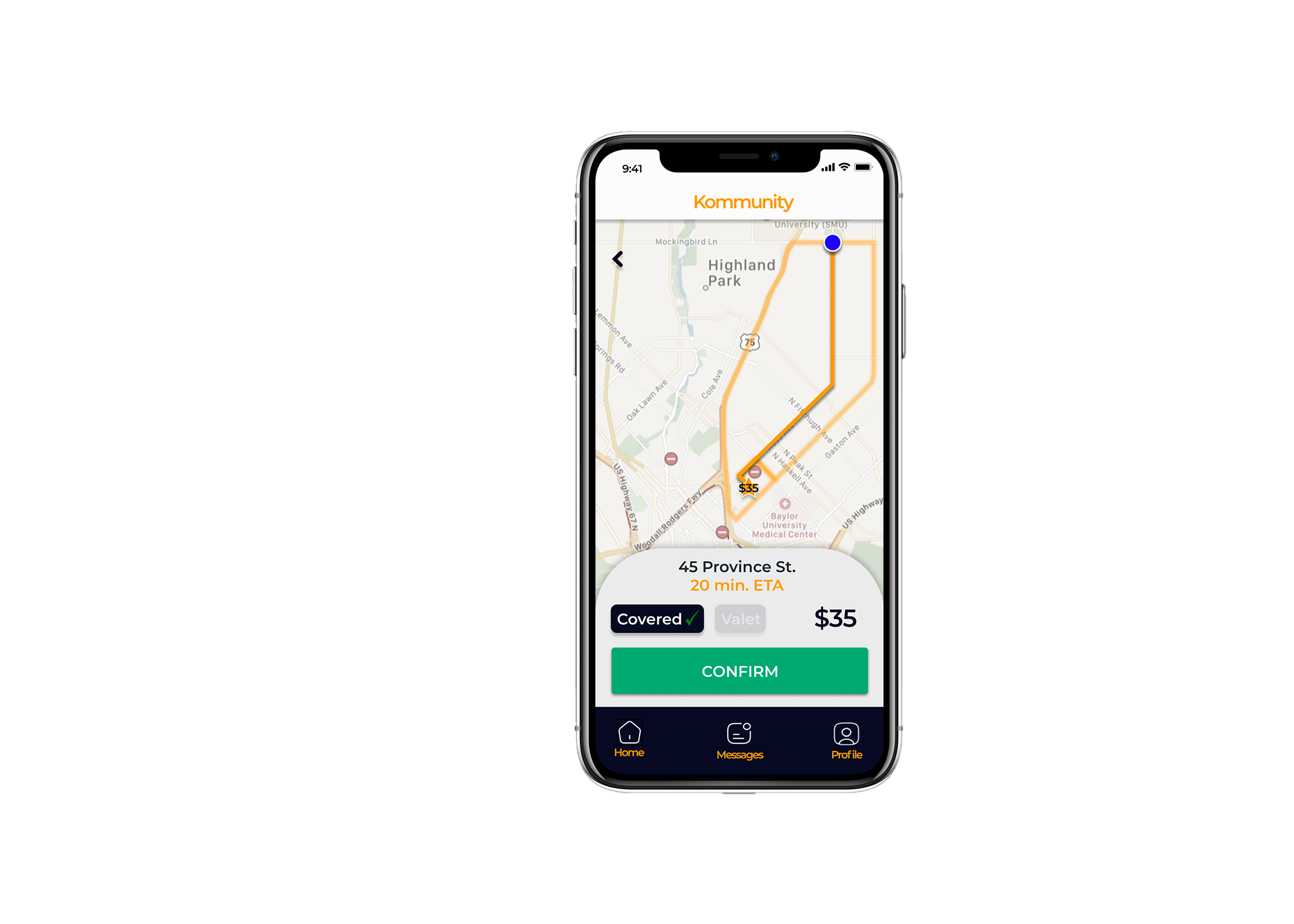
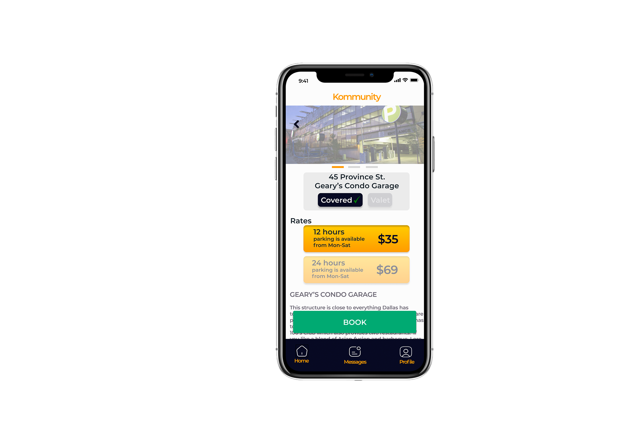
Adam H. mentioned that the rate of the parking may not be important information until after you select which parking you want. Just having the price with the icon on the map doesn’t tell you if it is an hourly-rate or a flat rate. If we leave all that information for the next page it will help with the cognitive load of the users on the map page.
The takeaway: Getting other people's perspectives during the usability testing was extremely helpful and necessary. Those insights allowed me to uncover some potential issues with the product that I was too close to see. Now, I have a tested design that works!
My Experience in Summary
Creating a fix to an ongoing issue I personally had to endure, feels extremely gratifying. Coming up with an original idea nowadays, seems like a feat and I believe the Kommunity Parking app brings a lot of originality to the users.
The initial idea was to strictly handle the issue of free, unmarked street parking. It then evolved into finding existing established parking (garages, structures, and lots) and reserving them before you get there.
The biggest gains were made during the research and testing stages. I enjoyed hearing the honest feedback from unbiased people. This part of the process was electric because it really shows you that even if you find a problem, research and define the problem, then design and test for the problem… you still haven't looked at it from a different perspective. I definitely spent hundreds more hours on this project than anyone else in the world and still I needed different perspectives in order to make a well-rounded product.
Moving forward, I hope to be able to design more products with the back-bone motivator, being my community. Community-based designing pairs perfectly with the process of UX design, by always putting the users at the forefront.
THANK YOU!

