PostUp (Google Venture) Design Sprint mobile app
— iOS/Android
Project Overview
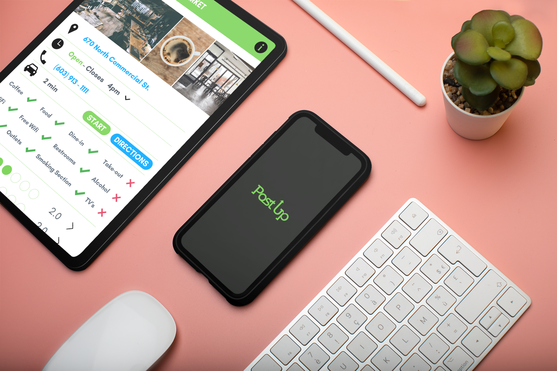
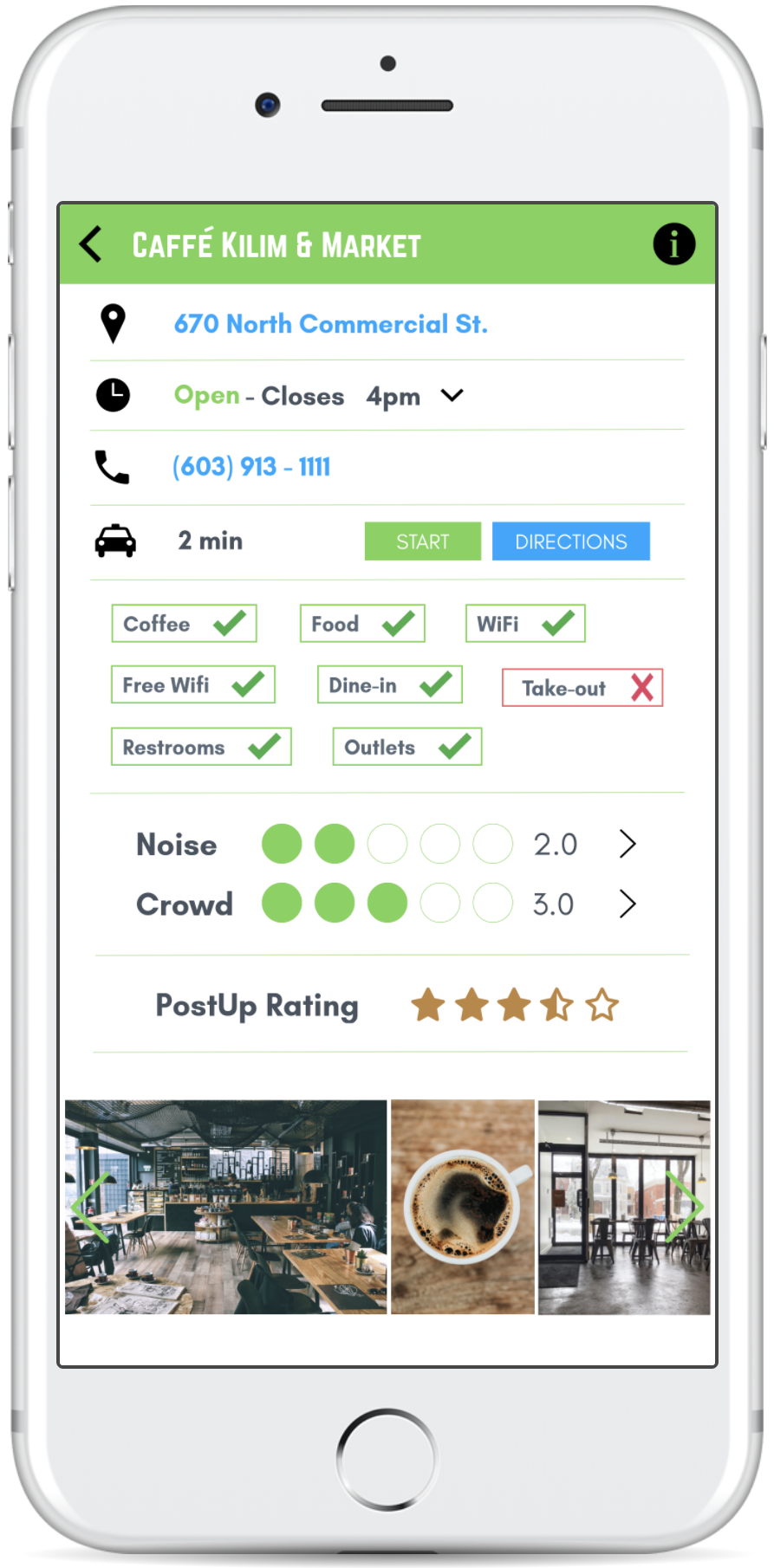
PostUp is a new startup that wants to help remote workers find great coffee shops and public places to work from. On this platform freelancers and remote workers share tips and advice for a monthly fee. Facility amenities, noise levels, and crowd meters can be viewed on the fly by PostUp users.
My Role
As a UX Designer my role was to develop a design sprint to test out the best mobile solution. I used a 5-day structure to efficiently but quickly gather data to design.
The Challenge
Provide users with the ability to find existing establishments that fit their workspace needs.
DAY 1
Understand / Map
Takeaways from Research
Users are looking for a place with good wifi; ideally for free
Users are looking for a place with little background noise so taking calls isn’t a hassle
Users are looking for a place that won’t be crowded and distracting
Having amenities, such as a bathroom, is a major necessity
Facilities need to have available seating for meetings that may take an extended amount of time
Outlets are a necessity
Having good food and coffee is always a nice perk
Being able to access workspaces in different and new cities is crucial when unfamiliar with the area
Ideally looking for a welcoming environment (it can be uncomfortable to be the only one on your laptop and you do not want to be asked to leave in the middle of work)
Users will use any photographs provided from the facility to gage the environment
Users could be looking for a place between meetings to make phone calls or get some work done
Users get frustrated when looking for a spot to sit. They feel it’s wasted time
Initial Reflections
This application has to provide useful details when exploring each facility. Go deeper into amenities and services provided to separate itself from just “google’ing” and/or a map app.
Using a community driven platform means the app will constantly be growing and the design needs to be able to adapt and evolve
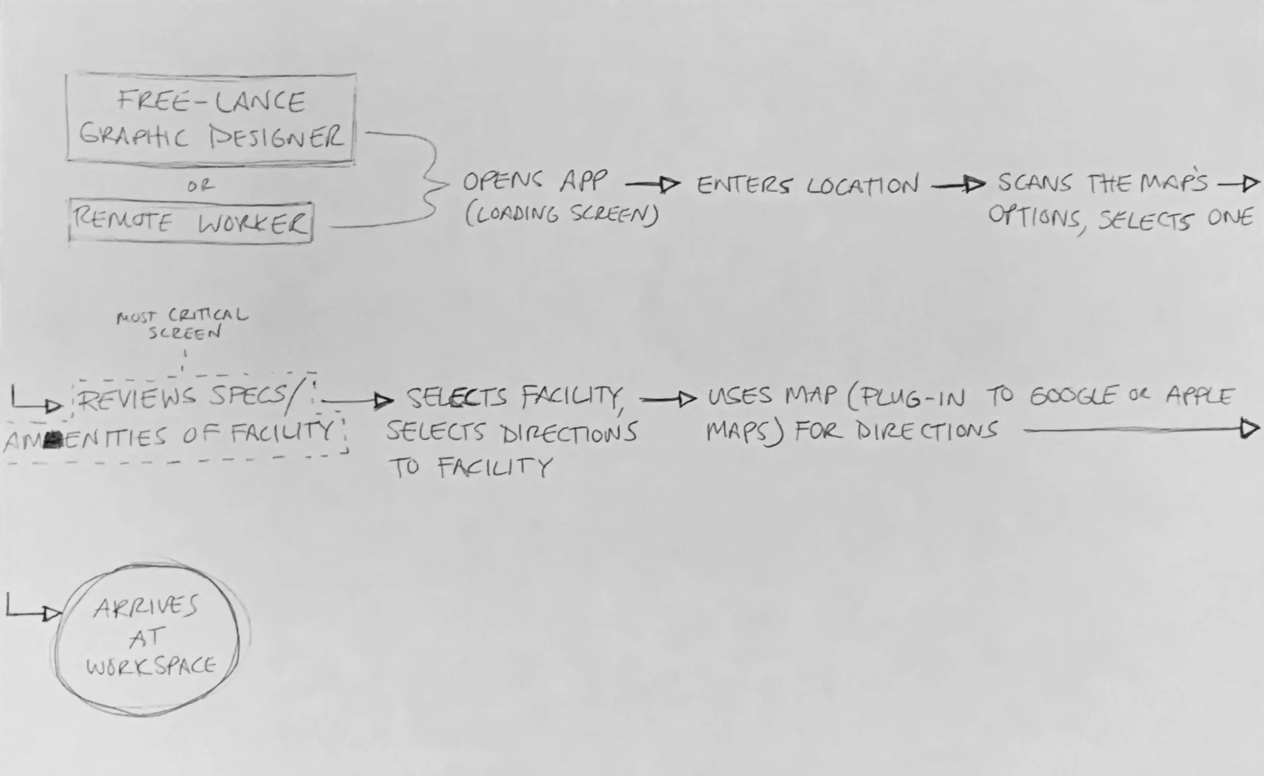
End-to-End User Experience Map
This is the first process to get the “visualization wheels” turning. Here, I have decided who I am designing for and what the end goal is. In between the who and the what, are the steps that the user must take to complete the journey. During this process I pictured the steps as screens and the arrows as transitions. Absolutely nothing in this workflow is permanent but it is the foundation of ideas, moving forward.
DAY 2
Lightning Demos / Sketching
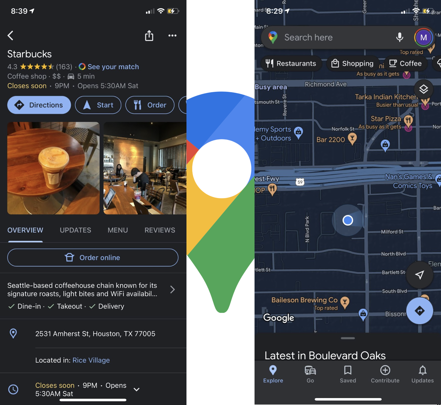
Google Maps:
This app has an awesome interactive map. I love the layout of the interface once you have selected a location, the interface provides you with all the information you need at a glance and it’s very accessible to dig deeper into the details of the location
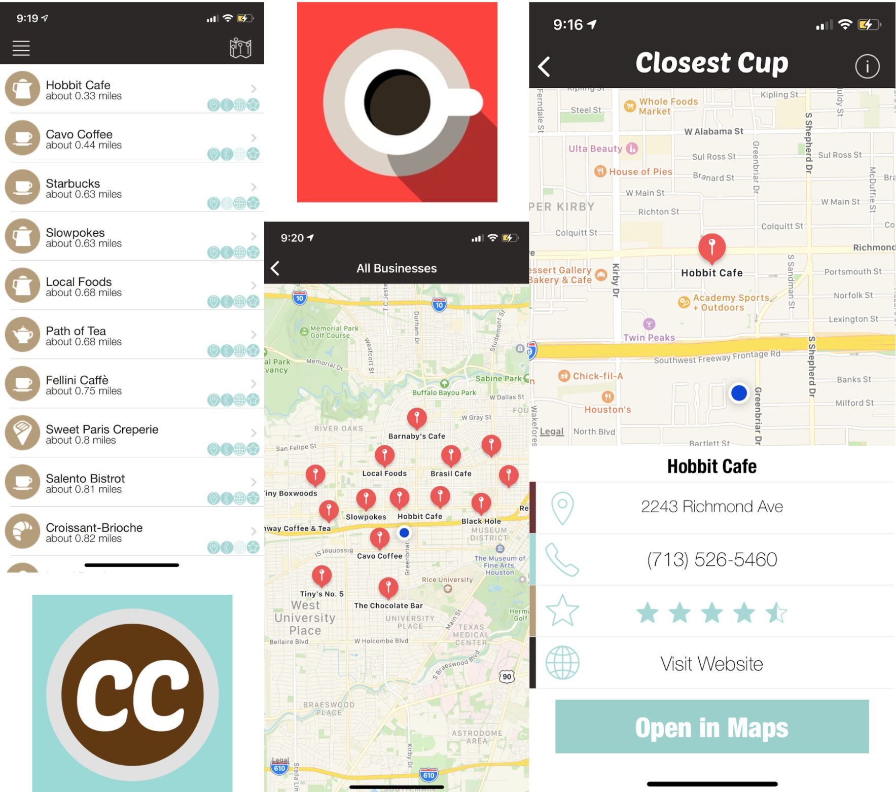
Closest Cup:
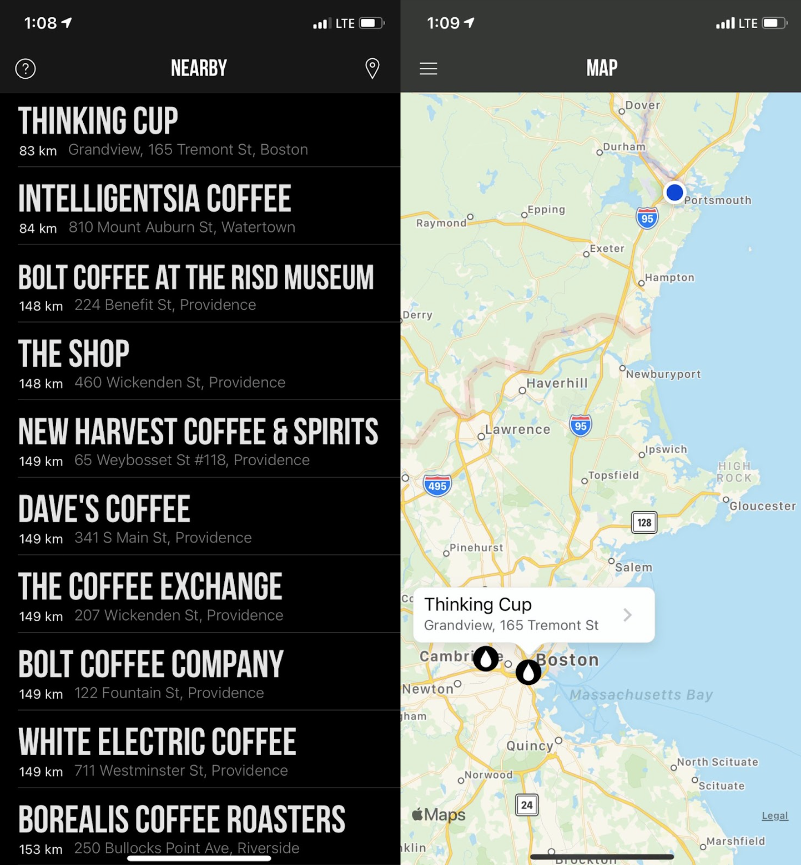
This app is super simple and to the point. No cognitive loading but also not a lot of details about the locations. I think this setup with options for more details on the locations would be a great start to PostUp.
Cuppings:
Cuppings was an app similar to “Closest Cup.” It didn’t have any research done in my area so it wasn’t helpful for users in New Hampshire (my location)but I did like some design ideas from the interface. I also enjoyed the fact that it gives you more information about the facility on the list menu (including its distance and address)
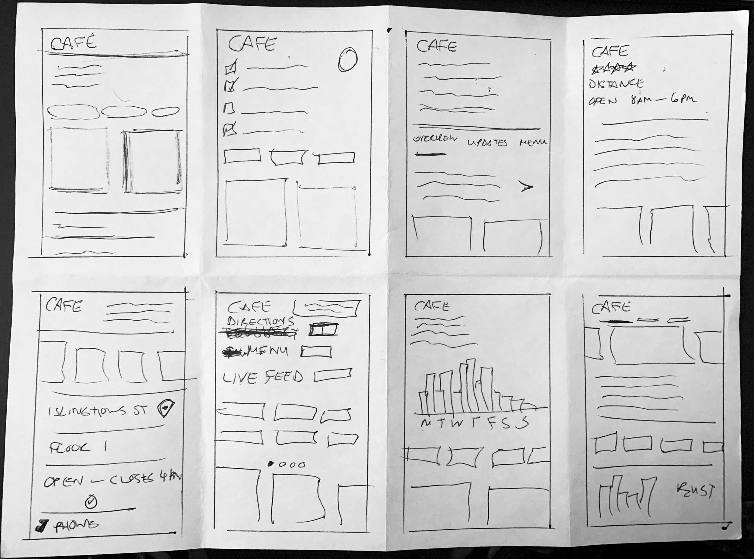
Crazy 8 Exercise
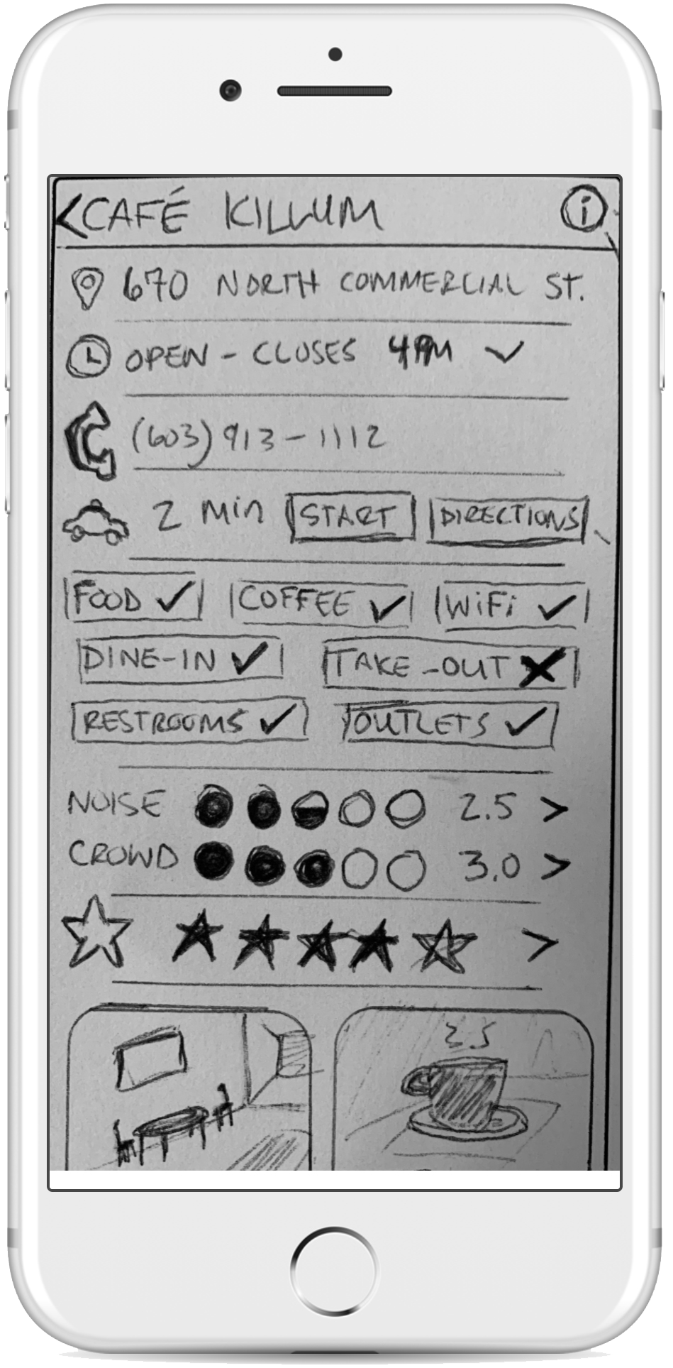
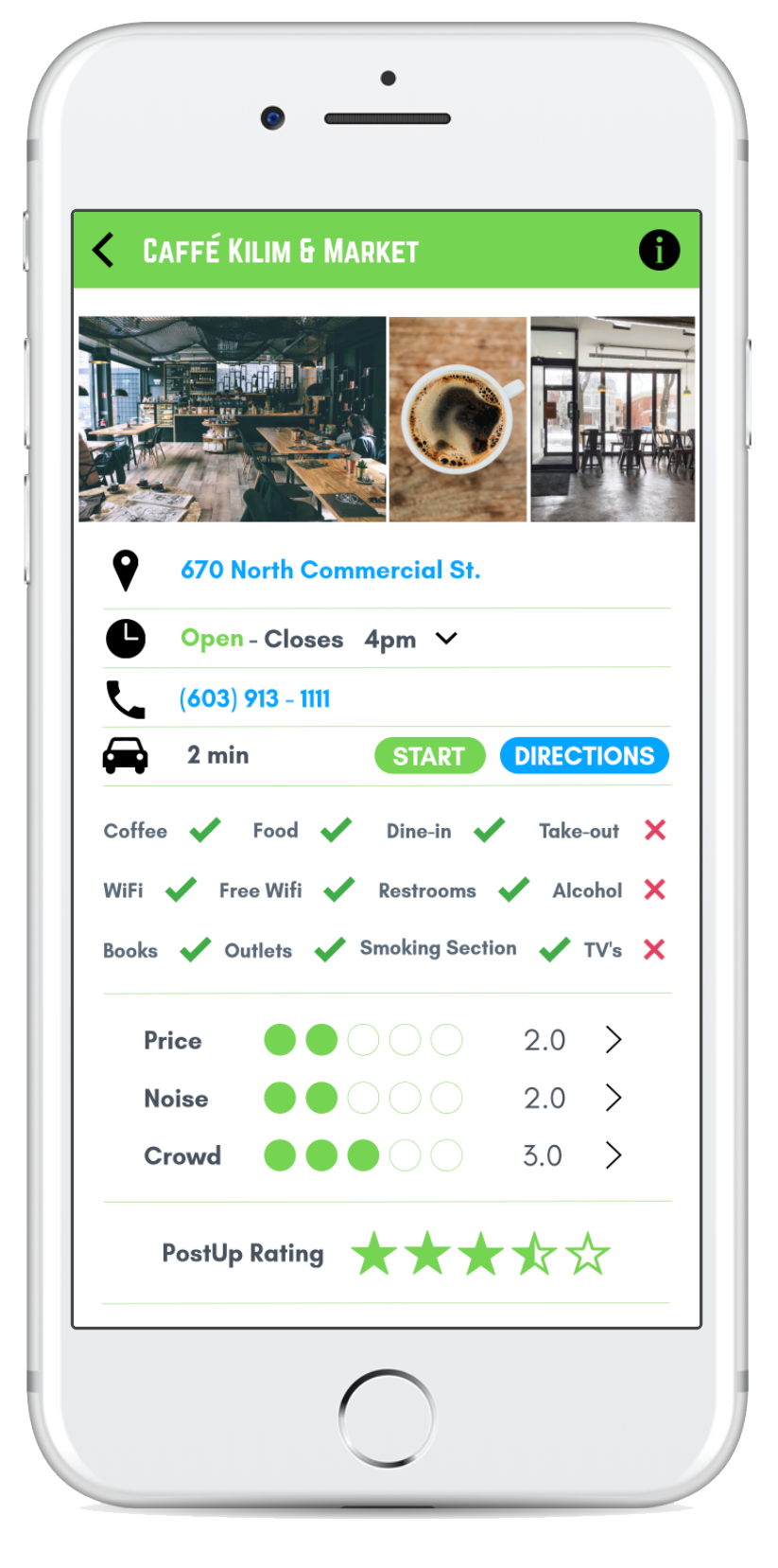
Crazy 8's is a core Design Sprint method. It is a fast sketching exercise that challenges people to sketch eight distinct ideas in eight minutes. The goal is to push beyond your first idea, frequently the least innovative, and to generate a wide variety of solutions to your challenge. I selected the screen that provides details of the selected facility. I selected this screen as the most critical screen because this feature will separate PostUp from other coffee shop locator apps.
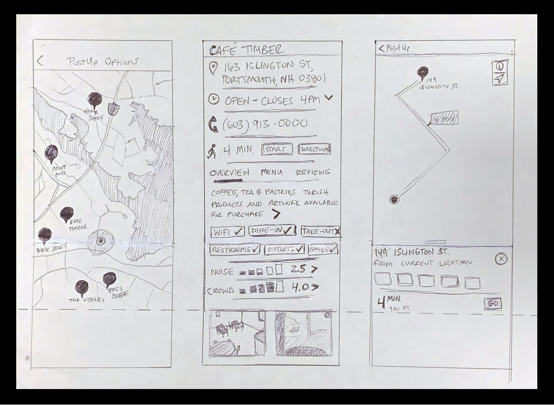
Solution Sketch
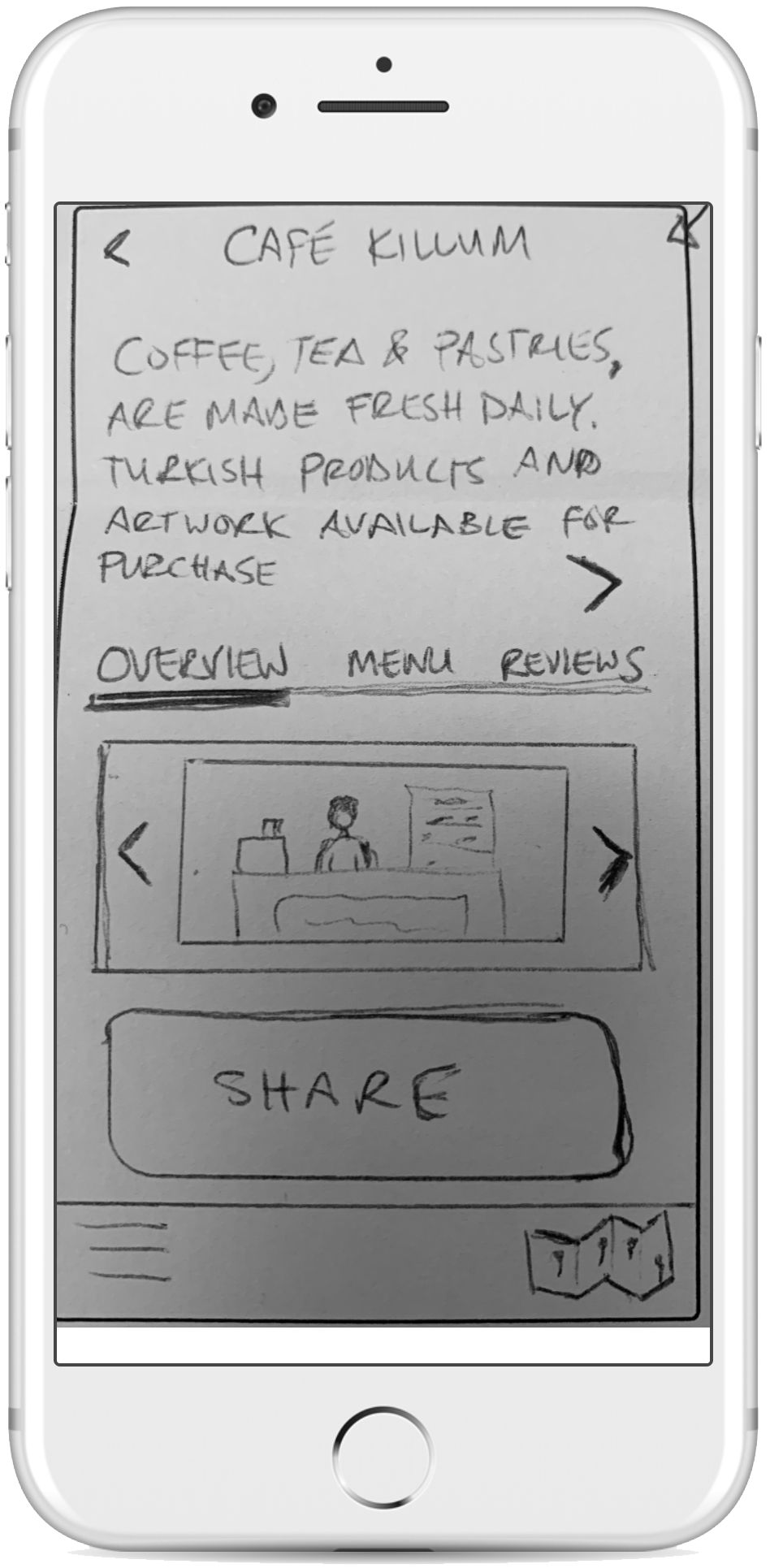
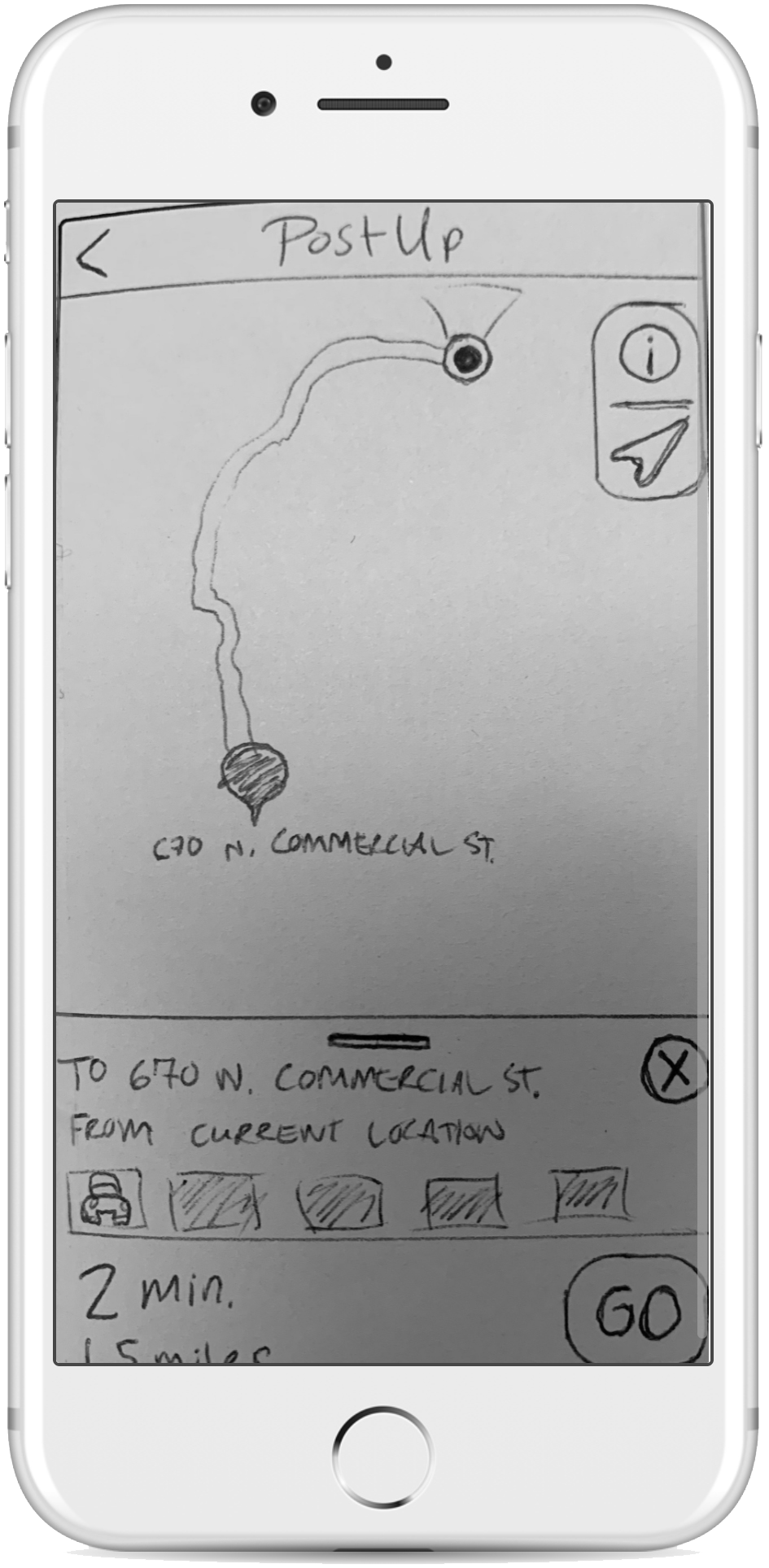
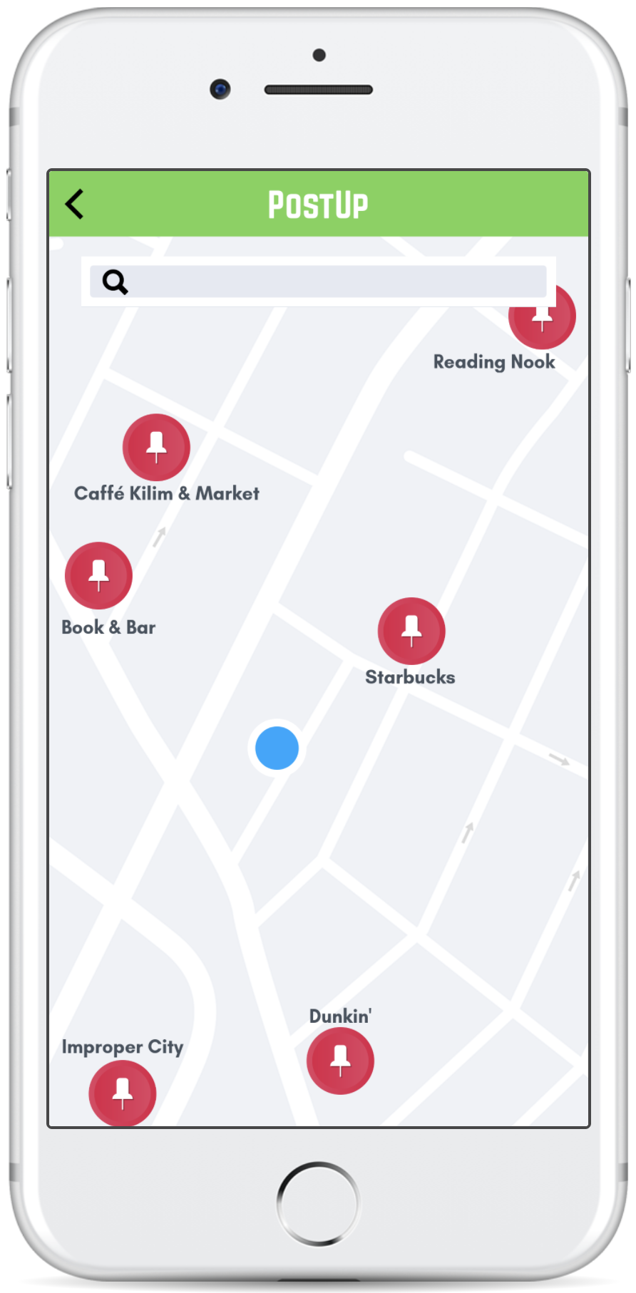
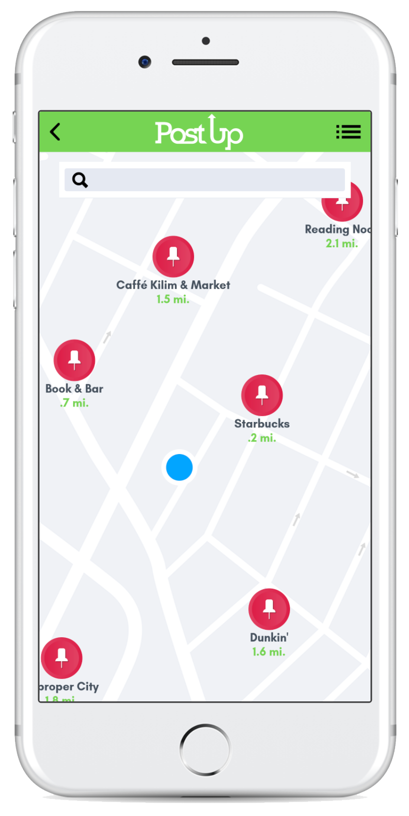
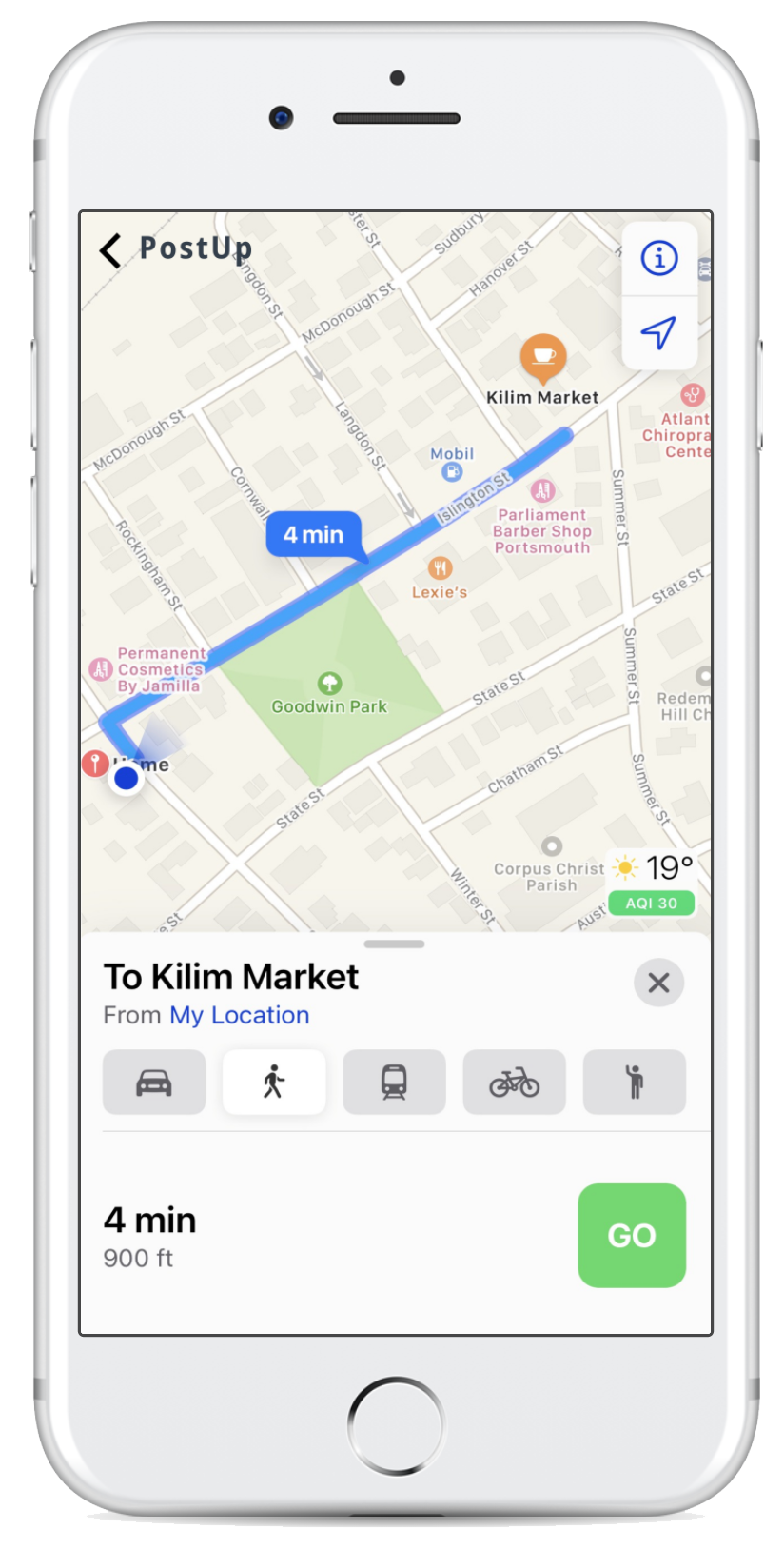
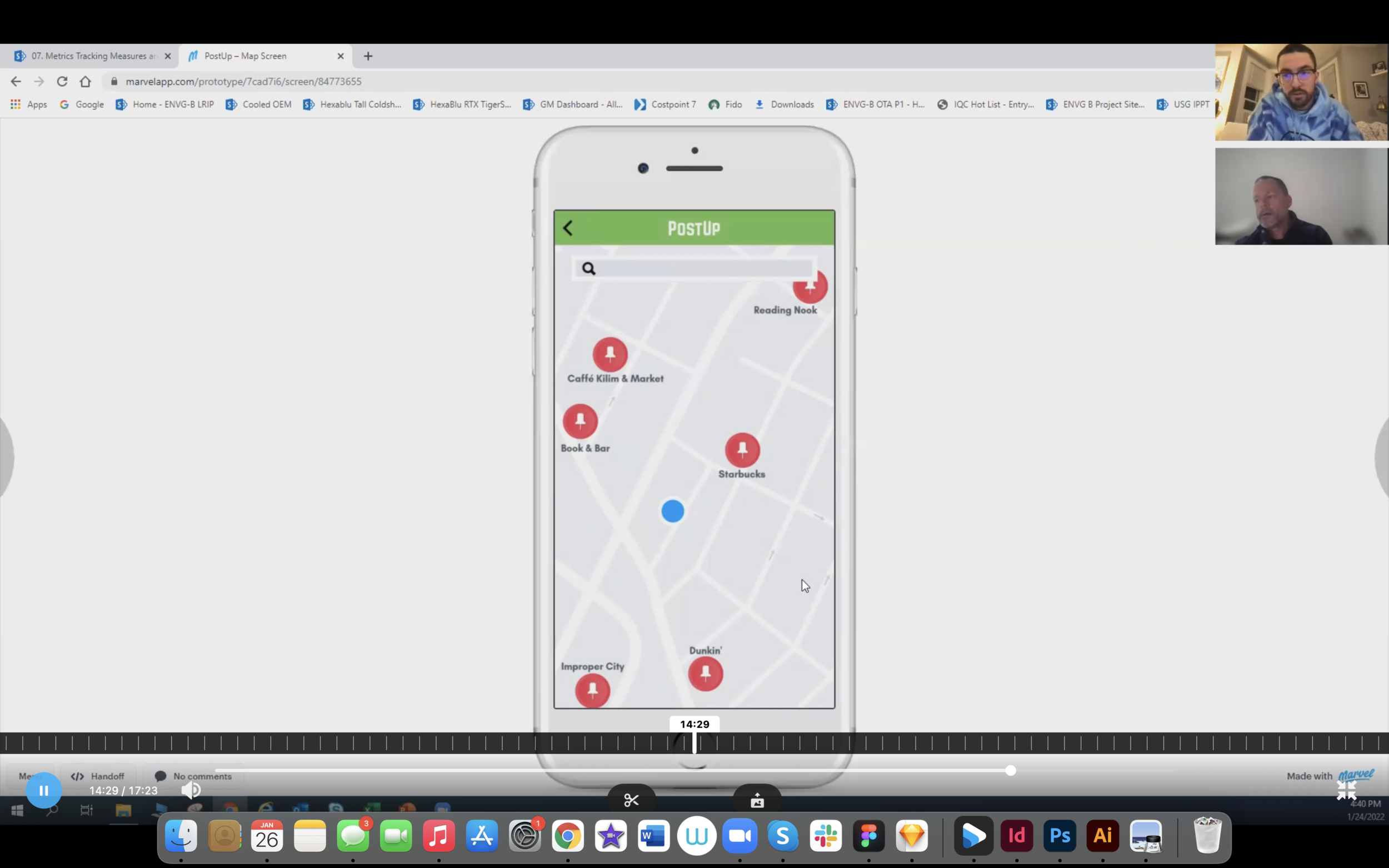
This is a three-panel board of the screen that comes before the critical screen, the critical screen itself, and the screen that comes after. The critical screen (middle screen) for PostUp is the screen with all the details of the selected facility. The screen that comes before the critical screen is a map view of the options of facilities. Lastly, the screen after the critical screen consists of directions via a map plug-in (google maps or apple maps) to the facility selected.
DAY 3
Decide & Create Storyboard
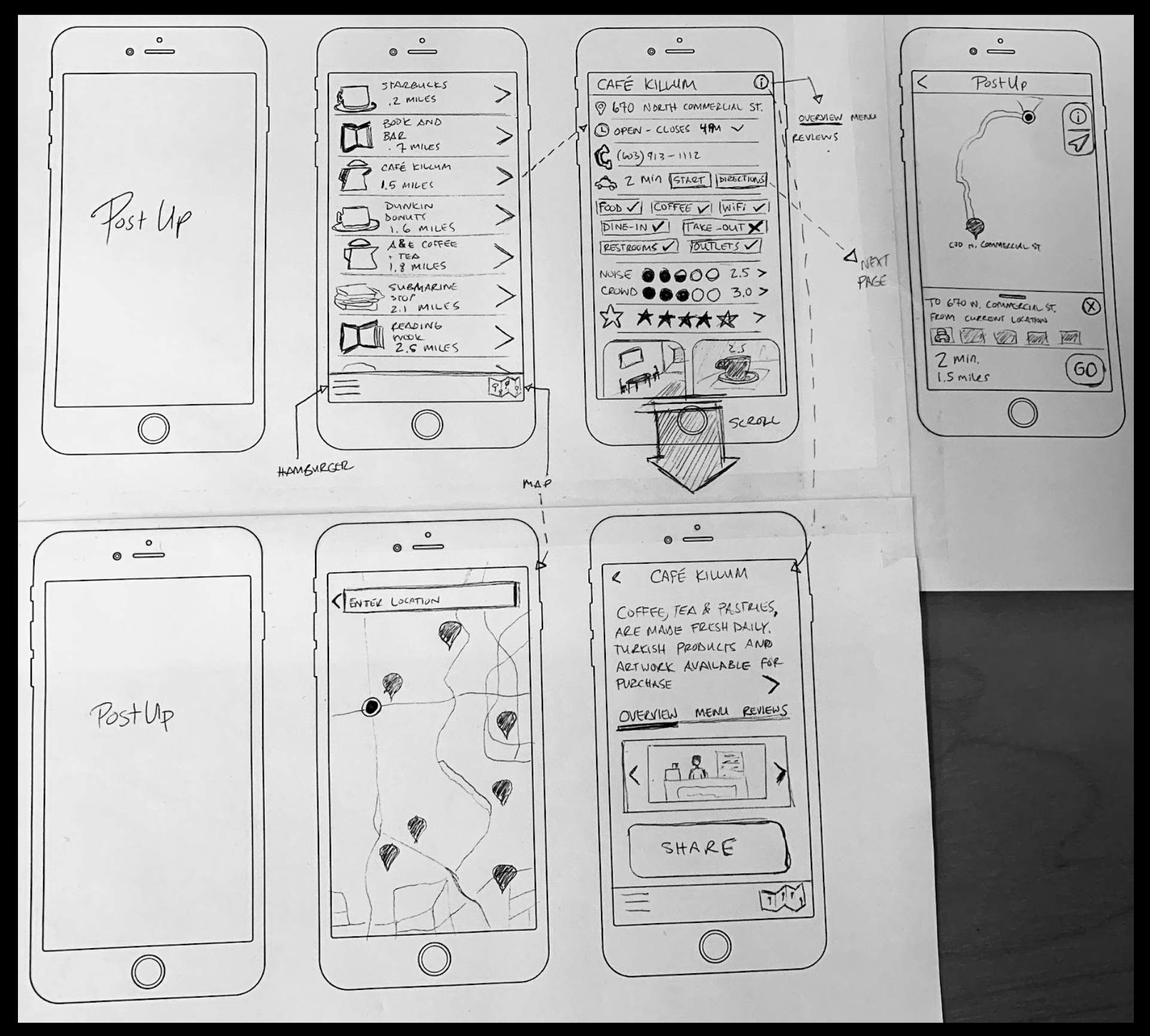
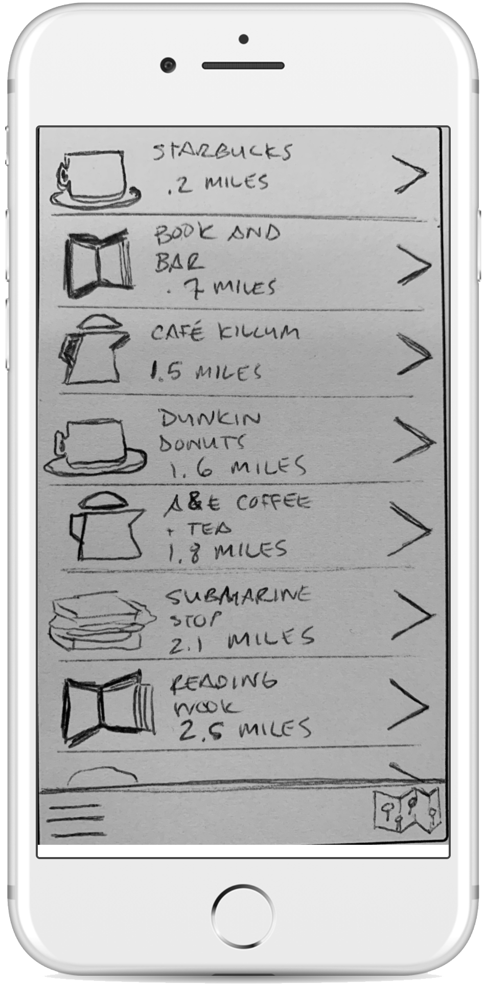
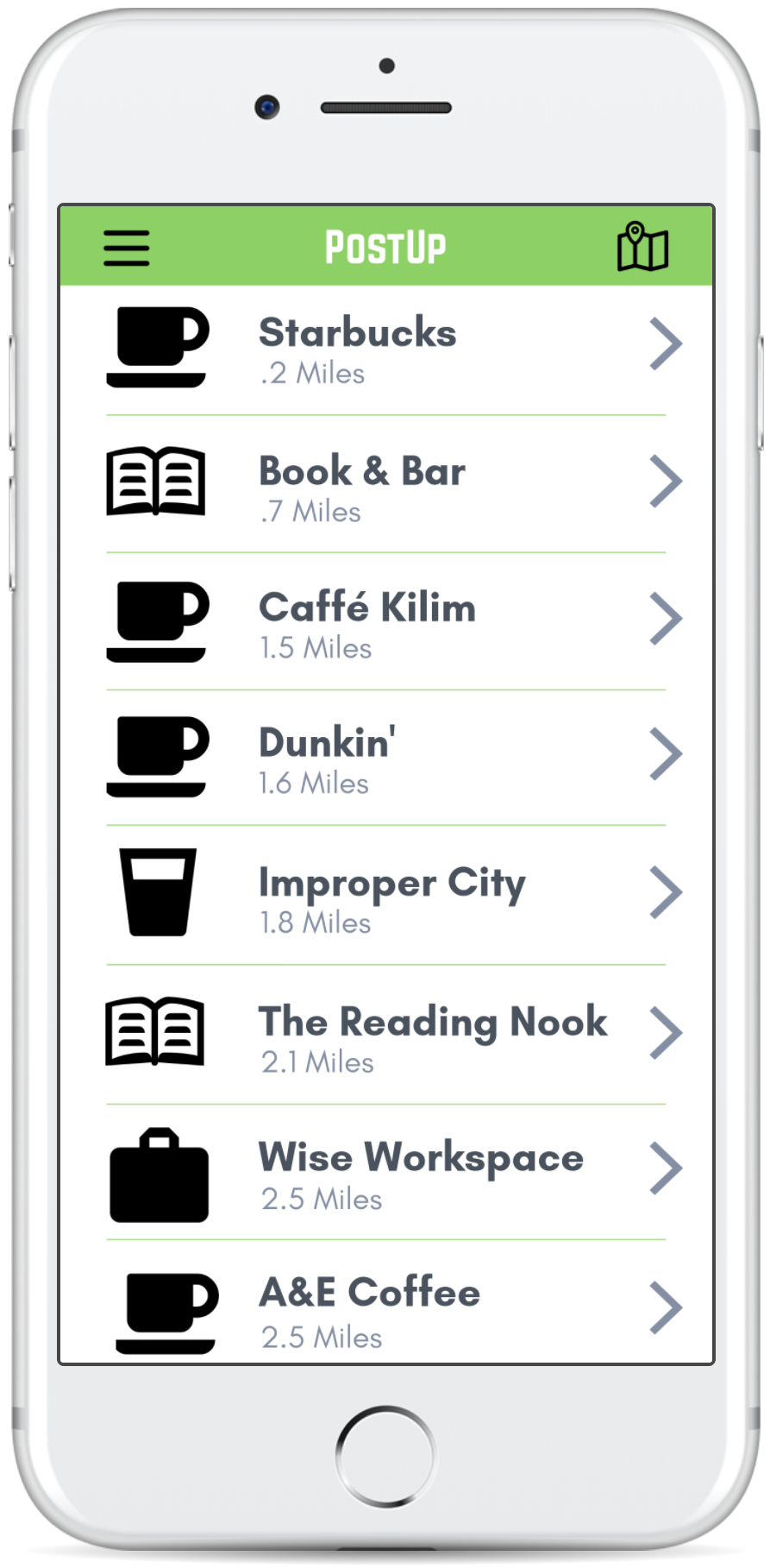
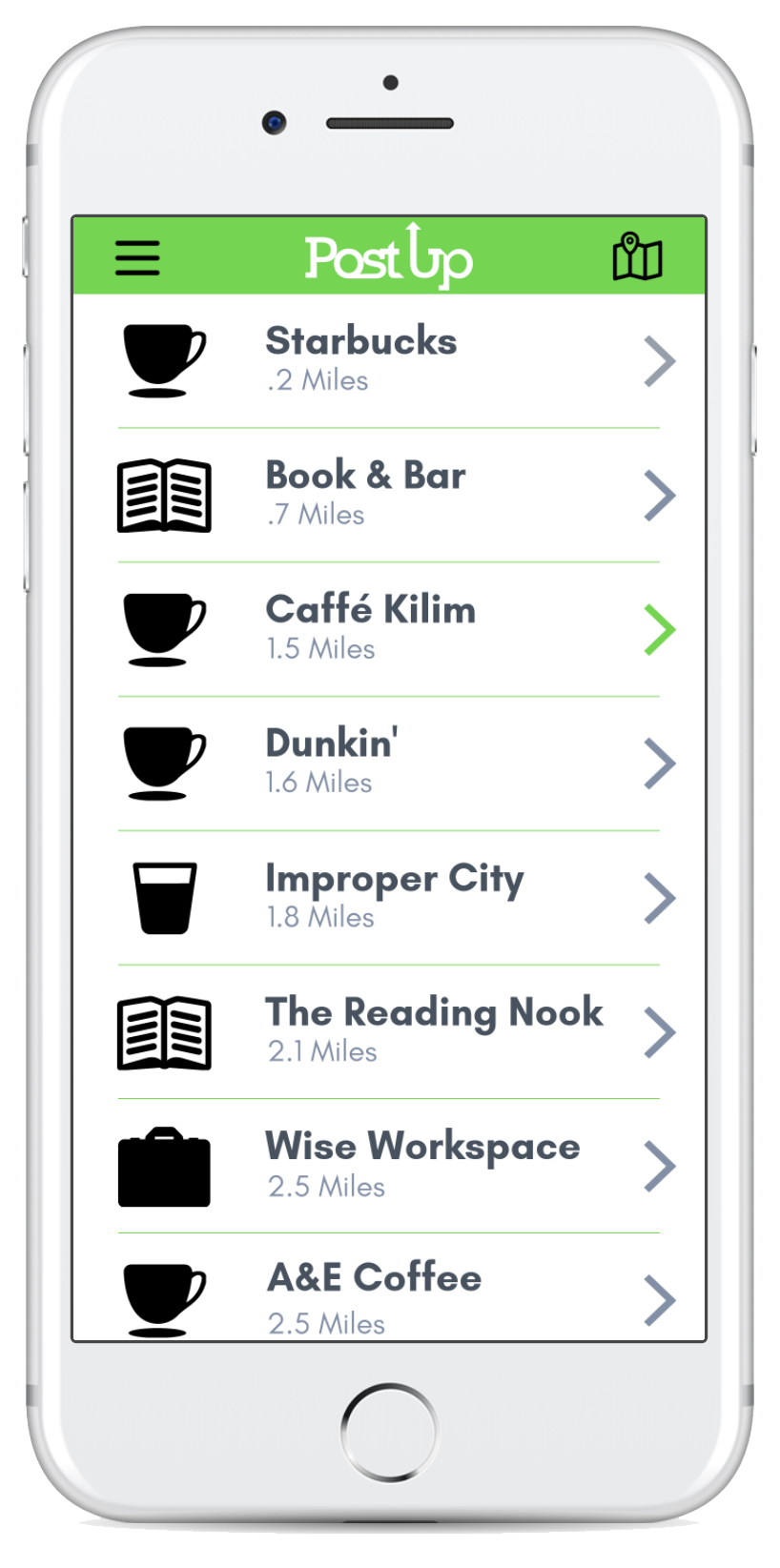
During this process I was able to find that I don’t want to start with a map after the loading screen. By starting with a list of local workspaces, it subsides the need to look at a map.
While sketching these screens I really wanted to focus on the hierarchy of elements. Using the feedback from the research, I was able to prioritize the necessities of the users and apply those to the design and dictate how the eye travels per screen.
DAY 4
Prototyping
The prototyping was a fluid process and I chose to use the Marvel platform to bring the sketches to life. Because this is a design sprint, Marvel is a great resource to use for a quick solution with enough features to build all your screens. My goals for testing the prototype were to:
Find bottlenecks in the process (cognitive loading)
See how much time users spend gaining the details of each workspace
See if the symbols used, translate to the users
Prototypes V1 (before the UI Clean Up)
Logo & Icon Design
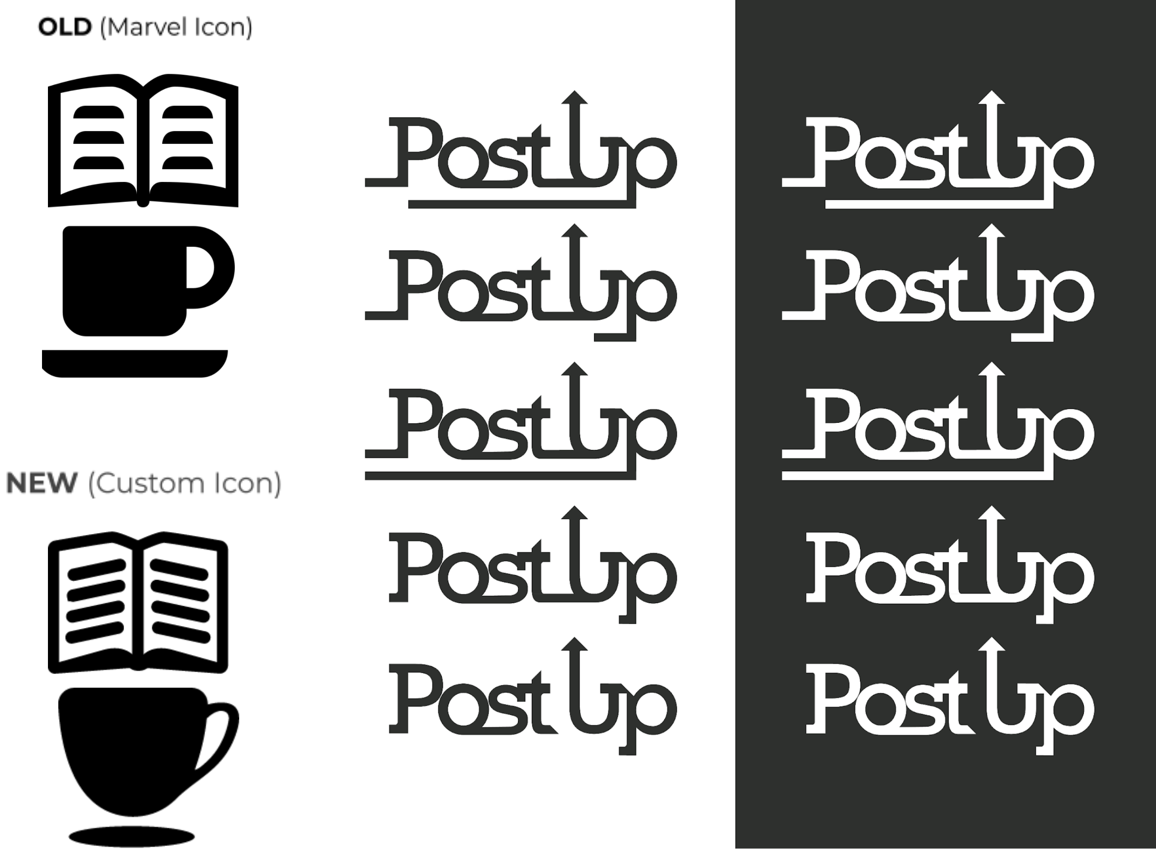
In an effort to make the interface of PostUp more streamline I from the ones provided through Marvel. During the “UI clean-up” process, I also did a logo revamp. When I was designing the logo, I wanted to take advantage of the fun name and incorporate the “up” direction.
Prototypes V2 (Updated UI)
DAY 5
Validate
Testing the Prototype
Participants: 5
Location: In-Person (Portsmouth, NH) or via Zoom calls
Duration: 30+ minutes (each)
The first set of usability testing was very insightful. Because the red route is very short and to the point, I was able to get a lot of feedback with only 6 prototype screens. I interviewed 5 people separately, 2 in person and 3 over a zoom call with shared screens. In recruiting these people, I chose people who have been helpful in the past or who could benefit from PostUp. Participants ranged in age from 26 to 64 and were all located in the lower 48 States of the US.
Separate interviews with participants revealed similar patterns. 3 out of the 5 interviewees talked about how they enjoyed the map over the list view, better. Comparing the map to the list, Alan H. (55) mentioned that:
“... just seeing the space can help me determine if it’s a good fit, in a matter of seconds.”
Also, it was suggested that the font on the "start" and "directions" buttons could be improved by giving them more weight.
The findings after testing were plentiful and to the point. One takeaway was that the use of charts on the facility details page was a quick and convenient way to read that information. Moving forward, I would like to test if listing the amenities versus making them buttons with check marks or x’s, would be more effective. This will be interesting to see what people spend more cognitive time on.
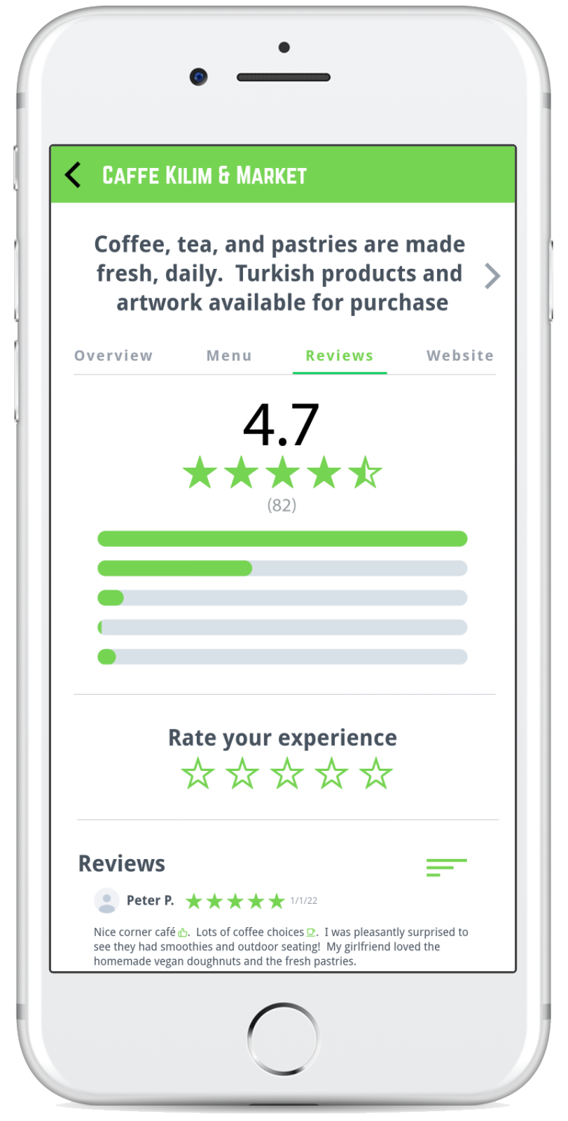
After testing, it became abundant to adjust the hierarchy on the facility details and info pages. Using bigger font on the items at the top of the page helps direct the user in the order you would like the page to be viewed. I would like to add a magnifying glass element to these scrolling pages. In doing so, as you scroll the page, the elements would grow as they reach the top of the screen. This would allow you to fit more on a screen and keep the hierarchy intended.
Lastly, having both the map and list options to the users was crucial. The list will provide the fastest method with the least amount of cognitive loading. This feature would be especially useful if the user was familiar with the area. Unlike the list screen, the map could provide more information than just the name of the facility & the current distance away. The map would allow the user to see what part of town it is in. Just because something is closer (proximity-wise) doesn’t mean it will take the least amount of time to arrive there. When considering one-way roads, traffic, and time of day, these elements play a role in the user’s decision making.
My Experience in Summary
My personal satisfaction comes from the fact that I am able to fix an ongoing issue for freelancers and remote workers alike. Using a system where users have the leg-up on non-users makes for a tight knit society of like-minded workers. As contributing members of PostUp continue to add intel to the app, the community becomes more knowledgeable.
The biggest take away from this sprint was understanding the amenities that users seek when selecting a workplace. Certain amenities become “deal breakers” when selecting a local space. After gaining knowledge of what people are looking for, the next challenge was figuring out how to display this information. On Day 2 of the sprint, the lightning demos were great references to consider during the UI design process. I was able to use coffee apps to understand the MVP and Google Maps to reference how to display lots of content per screen.
Moving forward, I would have the first screen incorporate the map and list into one screen. In order to design the combination of screens, I would try using a sliding box that hides at the bottom of the screen. I think there would be definite value in further testing the ‘details screen.’ This way, we are more efficient with the design hierarchy on that page.
The design sprint successfully revealed some pain points for the users and exposed the niche that needs to be filled. This tool allows you to spend less time looking to do work and more time working in a space you enjoy.
THANK YOU!

